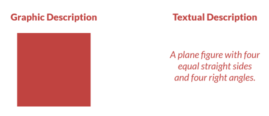
We are now in the age of visual information where visual content plays a role in every part of life. As 65 percent of the population are visual learners, graphics are key to engaging students in eLearning courses.
Visuals summarize content into smaller, and easier to process chunks, and when you select the right visuals, they offer more comprehensibility than text-based explanations or only audios. Also, students effortlessly relate emotions with visuals, which make what you’re eLearning courses more impactful and memorable than only adding text.
In this post, we will dig deep into some statistics and facts to further convince of why eLearning creators should embrace visuals when creating their courses.

1. Visuals Stick in Long-term Memory
Both the short-term and long-term memory store information in chunks, but the former is limited. One of the easiest ways to ensure that learners store information in their long-term memory is to pair concepts with meaningful images. Visuals help students make sense out of the content and direct attention, increasing the possibilities that the learners will remember the material.
According to Dr. Lynell Burmark, education consultant who writes and speaks about visual literacy: “…unless our words, concepts, ideas are hooked onto an image, they will go in one ear, sail through the brain, and go out the other ear. Words are processed by our short-term memory where we can only retain about seven bits of information (plus or minus 2) […]. Images, on the other hand, go directly into long-term memory where they are indelibly etched.”
Furthermore, this effect increases over time. One study found that after three days, a user retained only 10-20 percent of written or spoken information but almost sixty five percent of visual information. Another study showed that an illustrated text was nine percent more effective than text alone when testing immediate comprehension and 83 percent more effective when the test was delayed.
Also read: Making the Most of Visuals in eLearning: 9 Tips and 5 Examples
2. They Transmit Messages Faster
According to the Visual Teaching Alliance:
- The brain can see images that last for just 13 milliseconds.
- Our eyes can register 36,000 visual messages per hour.
- We can get the sense of a visual scene in less than 1/10 of a second.
- 90% of information transmitted to the brain is visual.
- Visuals are processed 60,000X faster in the brain than text.
- 40 percent of nerve fibers are linked to the retina
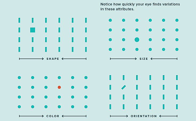
All this indicates human beings process visual information more efficiently than text. Just see it yourself:

Image source: Uberflip Blog
Taking all these into consideration, eLearning developers can use this knowledge in their course design to their advantage by including effective graphics to support understanding.
Think about it: What content would be better structured as an image or a video, rather than a bullet-list?
3. Improve Comprehension
Visuals have been found to improve learning by up to 400 percent. Also, they affect learners on a cognitive level and stimulate imagination, therefore, enabling users to process the information faster. Stanford University's Robert E. Horn, explained this relationship clearly "When words and visual elements are closely entwined, we create something new and we augment our communal intelligence ... visual language has the potential for increasing ‘human bandwidth'—the capacity to take in, comprehend, and more efficiently synthesize large amounts of new information."
Other studies have found that visuals such as graphic organizers improve performance in areas including:
• Reading comprehension
• Student achievement
• Organizing and communicating ideas
• Finding patterns and relationships
This infographic shows how our brains are pre-wired to automatically interpret relationships between objects, allowing for almost instant comprehension with minimal effort:

4. Visual Cues Trigger Emotions
Visuals cause a faster and stronger reaction than words. They help users engage with the content, and such emotional reactions influence information retention. This is because the visual memory is encoded in the medial temporal lobe of the brain, the same place where emotions are processed. The brain is set up in a way that visual stimuli and emotional response is easily linked, and together the two form memories. Negative visual depictions are particularly useful for leaving a strong emotional impression.
Even abstract concepts can benefit from images, when course creators use visual metaphors. Including visual metaphors in their eLearning course help express emotions to trigger a similar emotional response in students. See this example:
 Image Source: Visual Rhetoric Blog
5. They Also Motivate Learners
Around 40 percent of learners respond better to visual information than text alone. Simply seeing a picture allows users to recreate the experience in their mind. eLearning professionals can benefit from this by telling stories in their courses through entrancing images and compelling videos.
6. Take note: Incorrect Use of Visuals Can Also Deter Learners
It is important to note that graphics can also negatively impact learning if they are used inappropriately. When off-topic graphics appear on the screen, such as those used for purely decorative purposes, learners will subconsciously try to figure out the message and reason for the image.
The following are examples of images that course creators should always avoid in eLearning visual design:
- Pictures that are obviously stock photographs.
- Generic graphics that display a clear lack of imagination.
- Poor quality images that are pixelated, low-resolution, over-compressed, or badly resized.
On the other hand, well-selected images can improve comprehension and insight when developers strategically place such graphics within a course. Unlike text, pictures have the power to enrich communication and stimulate emotional response. In order to utilize visuals in a way that will reinforce course material and facilitate learning, it is necessary to use images that:
- Represent actual objects, people, or places.
- Simplify complex or abstract ideas.
- Bridge already learned materials with the unfamiliar.
eLearning designers should only use images that have a clear value, otherwise they are distractions at best and, at worst, give learners the wrong impression. This means omitting anything that does not directly support learning goals.


