According to a report by HubSpot, posts and tweets containing colored images increase viewers’ willingness to read by a whopping 80 percent!
Other research revealed readers remembered 65 percent of the information several days after viewing it when text was paired with one or more relevant images than a paltry 10 percent when the content was just a hunk of text.
Look at yourself. Would you like to watch a demo video and learn how to fix a broken washer or read through the pages of the instruction manual?
We love watching movies. We post photos of our trips on Facebook and not essays about our vacations. The power of visuals is undeniable!
As an eLearning course creator whose goal is to create memorable learning, you MUST NOT underestimate using this medium correctly when you design your courses.
In this post, you'll learn how to choose and create visuals that will resonate and connect with your learners and make your eLearning course sparkle. Here are the best practices that you cannot ignore:

1) Take your time to choose images
Choosing images for your eLearning course should not be an after-thought. It is not a chore that you approach without a thought and then do a slapdash job of it. A relevant, memorable image is a powerful instructional tool that drives learner engagement, reduces cognitive load, and fulfills the learning objectives most efficiently. The images you use in a course are as important as the text you write, the interactions you design, and the assessments you include.
Take time to choose images, and keep the following pointers in mind while you are at it:
- Even before you ponder over the visuals for a screen, figure out what message you want to deliver to the learners. Do you want to evoke a particular emotion in them? Do you want them to learn a procedure? Do you want them to take some positive action? When you have the answers to these questions, you can choose an image that is relevant.
- Judge a picture for relevance to the content of a screen or the course in general.
- Ensure that the image “clarifies” the content and aids in the learning process.
- Ask for help! Your SME on the course can help you find the right visual. As someone who has in-depth knowledge of the subject, he/she may know if a particular one will help your audience grasp the content easily.
2) Pair images with words
Why do you think the diagrams in our school textbooks were labeled?
Why do photographs published in newspapers and magazines come with captions?
That’s because pictures paired with words that identify or explain the content of the images have been proven to be more effective in helping retention and recall.
There have been several groundbreaking studies on the effectiveness of multimedia learning. According to Edward Tufte (1990), “words and pictures belong together.” In the book eLearning and the Science of Instruction (2008), Clarke and Mayer provide scientific evidence to prove that pairing visuals with text helps retention and recall.
According to Edward Tufte (1990), “words and pictures belong together.
Here’s how you can pair images with words to achieve maximum instructional effectiveness:
Embed text within images. But use crisp, concise text to eliminate confusion and ambiguity.
Execute the principles of Hick’s Law and place related text and images close to each other. This practice also establishes relevance.
Ensure that the image and its corresponding text convey the same idea.
Do not make the image so prominent that the text gets lost.
People don’t like to read text that seems to stretch for an eternity across the length and width of the slide. Break up large chunks of text that seem overwhelming with design elements like images.
See this example:

3) Look for images with people in them and use them to tell stories
Images with real people in them looking right into your eyes are more powerful than photographs of objects, stunning landscapes, or long-shots of groups of (seemingly indifferent) people going about their tasks. When people gaze at us, we are immediately drawn to them. Similarly, a face that is alive with emotions catches our eyes readily and remains etched in our memories for longer than an inexpressive face.
Make your course memorable by including pictures of real people, doing real things.
Here are some tips:
- Use close-up shots of people who look right into the eyes of the learners. An intense gaze is hard to ignore. Besides, a gaze always gives off the impression that the person in front of you is trying to reach out and communicate with you.
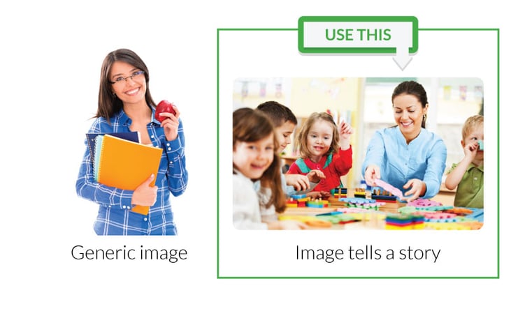
- Make images relatable and human. Try to stay away from generic stock photographs.
- Use images that show people doing things that your learners are also likely to do in their daily lives. This enhances relevance.
- Use images that tell a story. As human beings, the hint of a story always excites us. The bottom-line: Use images to communicate and NOT as fillers.
- Choose images with people who are expressing some emotion. Neutral, expressionless faces do not convey anything whereas a face full of emotion intrigues learners, and they want to know more about what’s behind that smile, frown, tear, or pout.
Example: Compare these images

4) Use images that connect with your audience
Like attracts like. We are drawn to people and situations that mirror our reality. We want to know more about people whom we can relate to.
You can keep learners hooked to your course if you can convince them that you will talk about them, their workplace problems, and the type of people that they come across and interact with in their daily lives and the circumstances that affect their job. In short, your learners want to see themselves in your course.
For instance, if your learners are physicians, you have to ensure that the images you use in the course show physicians going about their work.
Here’s what you should keep in mind while choosing images that resonate with your corporate learners:
- Familiarize yourself with your target audience. Learn about their workplace, how they dress, and their job roles and responsibilities. This knowledge will help you choose or create visuals that feel familiar to them and resemble their workplace.
- Choose or shoot photographs that depict typical corporate scenes: corporate workers engaged in tasks that the average learner taking your course is also expected to perform at his workplace. This creates relevance and relatability.
- Use emotive color palettes. Do not be afraid to experiment with colors and filters to make an image speak to the heart of the learners. But first, figure out what emotions do you want your learners to experience. Do you want an image to exude a light, breezy, summery feel? Then infuse some vibrant reds and oranges and a splash of warm, earthy brown into the color palette.
Also read: These 27 Questions Will Help You (Really) Know Your Learners
5) Embrace familiarity
Familiarity is comforting. Familiar symbols, language, and references assure learners that they will be able to wrap their wits around the course. This serves as a motivation. When they are not intimidated by the course, they look forward to it.
Using familiar icons also facilitates the learning process by helping learners spot similarities, decipher underlying patterns, and form associations. These eventually help them comprehend the material better and retain it for longer periods. For instance, you can use icons in place of standard bullets. Also, create visual metaphors that will be understood universally. Your learners may not share similar life experiences, cultural backgrounds, and mindsets and thought patterns. So it is important that you use visuals that appeal to the sense, sensibility, and intellect of all learners.
Also read: Graphic Design Tips for Accidental Instructional Designers
6) Variety
They say variety is the spice of life.
Nobody would dispute this statement. We all love to step out of our daily routines. We love variety in our meals and attires. Your learners will love it too if you give them an assortment of visuals to feast their senses on.
Besides, according to learning disabilities specialist Janet Brain, a variety of visuals aids the learning process by reinforcing the material multiple times. What is more, an assortment of visuals keeps learners guessing about what you will next throw at them. They are more engaged with the course and less likely to doze off from boredom.
Here are some ideas:
- Think beyond photographs. Use charts, graphs, typographic images, and illustrations to summarize key points.
- Share shocking facts and statistics with infographics. The human brain can process visuals 60,000 times faster than it can comprehend text! Infographics let you present large blocks of information in a visually arresting way using snippets of text and images. Here are some tips on how you can use infographics smartly to add a sheen to your course.
- Use animated GIFS or videos when possible. Aim to weave in “moments” that transport your audience to a different world. For instance, you can play a video instead of presenting the content in the form of a text or present a scenario in the graphic novel format instead of having the narrator read out the story.
Here are some more ideas on how you can incorporate many different kinds of visuals in your course.
7) Think out-of-the-box
There is no ceiling to how creative you can be with visuals. Do not be afraid to think out-of-the-box. Don't be scared to experiment and bring in novelty and variety to your course. Take inspiration from the world around you—the product packaging you see on the supermarket shelves, movies, comics, newspaper ads, or the natural world.
Here are some ideas for creating original visuals that will take your eLearning course from “okay” to “ooh-la-la”:
- Close crops that take learners closer than they have ever gone before
- Unusual points-of-views that reveal the unseen and sometimes, the unknown
- Before-and-after photographs, especially in the case of healthcare products and services
- Behind-the-scenes visuals
- Super-sensory images that hit hard at the senses and evoke strong emotions
8) Create responsive visuals
You may spend hours searching for the right image and then some more time, trying to weave the image into the content. But all your efforts will fail if you don’t design a responsive eLearning course.
This is an age the multi-device learner. Different devices render images using varied algorithms. An image that wowed one and all when it showed up on a smart device with a large screen may not have the same impact on a smaller device. Before publishing your course, make sure your images look perfect on as many devices as possible. Test, test, test!!
9) Don't forget copyright laws
In your quest to zero in on the perfect image, do not forget copyright laws. The laws are tricky to make sense of, and with everybody posting zillions of images on the internet every day, it is hard to figure out which ones you can use. Read up the rules here and stay on the right side of law.
Bookmark these sites: Our Top Picks for Where to Find the Best Free Images for eLearning
Visuals pack in a punch when you use them sensibly and responsibly. With countless distractions pulling your learners in all directions, smart visuals keep them hooked to your course and help them retain the learning.
REFERENCES:
Whitepaper. Leveraging multimedia for learning. By Ruth Clark.https://www.clarix.com/whitepapers/captivate_leveraging_multimedia.pdf
The 5 Qualities of the Most Memorable Images https://blog.bufferapp.com/memorable-images
What Makes an Image Good for Presentations https://www.powerpointninja.com/graphics/what-makes-an-image-good-for-presentations-part-i/
Creating Effective Visual Metaphors By Vicki S. Williams https://www.personal.psu.edu/staff/v/q/vqw/Portfolio/VislMeta.pdf
How metaphors can improve your user experience https://blog.usabilla.com/how-metaphors-can-improve-your-user-experience/


