“Responsive” is IN. It is the buzzword amongst web designers, website developers, and content creators. And it is time eLearning professionals learned it as well. Your learners have access to a host of devices with different display capabilities. After working hard to design and develop a course, you will want it to show up in all its glory and fidelity whatever the device it runs on.
But wait… What is Responsive Design?
In Responsive Web Design (RWD), the on-screen content realigns itself automatically depending on the size and resolution of the screen it is being displayed on. This ensures optimal viewing performance irrespective of the nature of the device.
For instance, if you are viewing a course that features a Responsive Design, be assured that you won’t be made to pan endlessly or squint to read the text even if you choose to access it on your hand-held mobile device whose screen is smaller than that of your PC. The various graphical and textual elements will size and orient themselves automatically to match the dimensions of the screen. Similarly, you won’t have to resize the various on-screen elements if you choose to view the course on your laptop.
See: 50 Examples of Responsive Web Design
Busting the Myths Surrounding Responsive Design
The unique features and the novelty of the concept of Responsive Design have propounded several myths. You now know what is Responsive Design. Now learn what it is NOT. Here are the myth-busters:

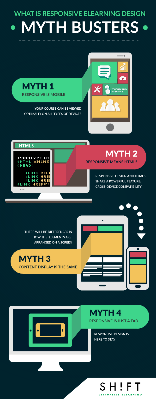
Myth #1: Responsive = Mobile
This is the biggest myth that surrounds Responsive Design, partly because the concept came into being as more and more people started using smartphones and other hand-held mobile devices to access digital content.
A mobile-optimized eLearning design is one that is exclusively developed to be viewed on smartphones and tablets.
Responsive Design actually means that there is only one version of your course that can be viewed optimally on all types of devices, including mobile devices. So a course that incorporates a Responsive Design shows up as intended not only on smartphones and tablets (both with standard and retina displays) but also on desktop PCs with many different resolutions like the usual 1024x768 and 800x600 pixels, 1366x768 pixels, and 1920x1080 pixels.
Responsive eLearning courses "respond" to ALL devices, not just mobile.
(VIDEO) Mobile Websites vs. Responsive Designed Websites
Myth #2: Responsive means HTML5
This is also one of the most common myths surrounding Responsive Design.
Responsive Design refers to a particular approach that lays down how a course should look and behave like so that it can be accessed optimally across many different platforms. HTML5 is a technology that lets you execute your designs whatever they may be. To be more specific, HTML5 is the latest version of HTML, which is the standard markup language used to create websites.
Responsive Design and HTML5 are NOT mutually exclusive. But they do share a powerful feature: cross-device compatibility. It is this feature that lets them pack in a punch when they are thrown in together!
HTML5 lets you create device-independent eLearning courses that can be accessed anywhere and even without an Internet connection because it lets you save and store content offline. This makes responsive eLearning courses built with HTML5 convenient for learners.
Read: The Relationship Between HTML5 and Responsive Web Design
Myth #3: Content display is the same
It is a common misconception that content that incorporates Responsive Design looks exactly the same across devices, only larger or smaller depending on the size of the screen. That's wrong.
Responsive Design does not mean that you just resize your page as you take your course across devices. In fact, if you do only this, you are not even creating Responsive Design!
The appeal of Responsive Design is that it takes into account the unique technical specifications and performance standards of every device. It finds its way around the limitations of a device to deliver an optimal viewing and/or browsing experience. This means that your page will NOT look the same across devices, but it will look familiar because it will adhere to the same overarching style guidelines. The content will be more or less (note the phrase “more or less”) similar across devices, but there will be differences in how the various elements are arranged on a screen, how they are spaced across screens, and what kind of viewing experience the course delivers.
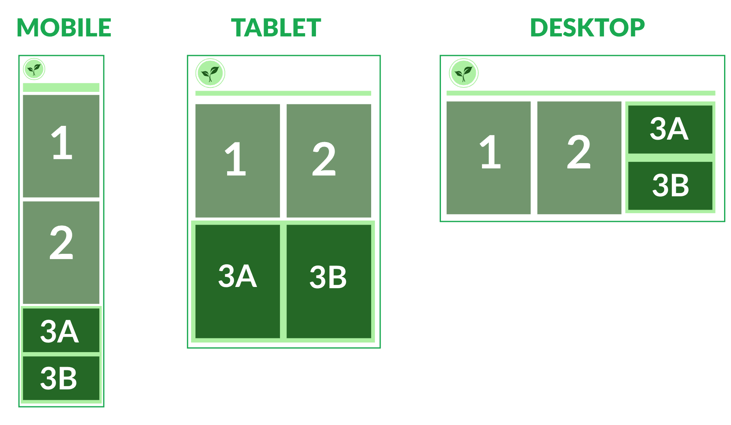
Below is a representation of how the content from a responsive site looks on a smartphone, on a tablet and on a desktop.

Now consider content block 3B.
On the desktop, this content block is on a highly visible part of the screen. You would want to place a critical piece of content in this block. But on a smartphone, this content block has got pushed back by several screens and has to be accessed by scrolling. Ideally, you should not place critical content here; it is good for nice-to-know information.
Myth #4: Responsive eLearning Design is Just a Fad
On the contrary, Responsive eLearning Design is here to stay. Period.
The ever-increasing use of mobile devices means that more and more learners have now access to multiple platforms. They will, of course, demand consistent viewing experiences across all devices. Besides, your corporate learners are busy people.
With meetings and presentations crowding their days, they are hardly tethered to their desks. They might prefer to take your course at a time that is convenient for them and on a device that they can readily access wherever they may be.
Now that you know Responsive Design is not going away anytime soon, it is time you upped your skills. After all, you will want to keep pace with your learners as they switch to newer devices and create courses that will hold their own in a multi-screen world.
Read:
- Why Responsive Web Design Is Here to Stay
- Responsive eLearning Is a Must-have, Not Just Nice-to-have
So, Why Should eLearning Professionals Care?
With the BYOD revolution slowly creeping in at workplaces, it is likely that your learners use a lot of different devices and browsers to view your course. Therefore, you have to know about the benefits it affords to you as a designer and to your learners. Incorporating Responsive Design into your courses ensures that you don’t have to create different versions for different devices. Read more benefits here.


