We like to be productive. So we create keyboard shortcuts. We make lists. We stick Post-it notes and set up reminders.
We don’t want to overlook details or stray away from standards. So we stick to rules, create guidelines, and follow templates.
Worksheets, templates, cheat sheets, checklists, and the like are nifty productivity tools. These help us keep our wits about us and our energies from being scattered in the midst of a flurry of activity and create flawless products without working long hours, plodding through multiple rounds of rework, and overshooting deadlines.
The following eLearning templates, cheat sheets, and checklists will ensure that you dot the i’s and cross the t’s and don’t miss the fine print while scrambling to make the deadline:
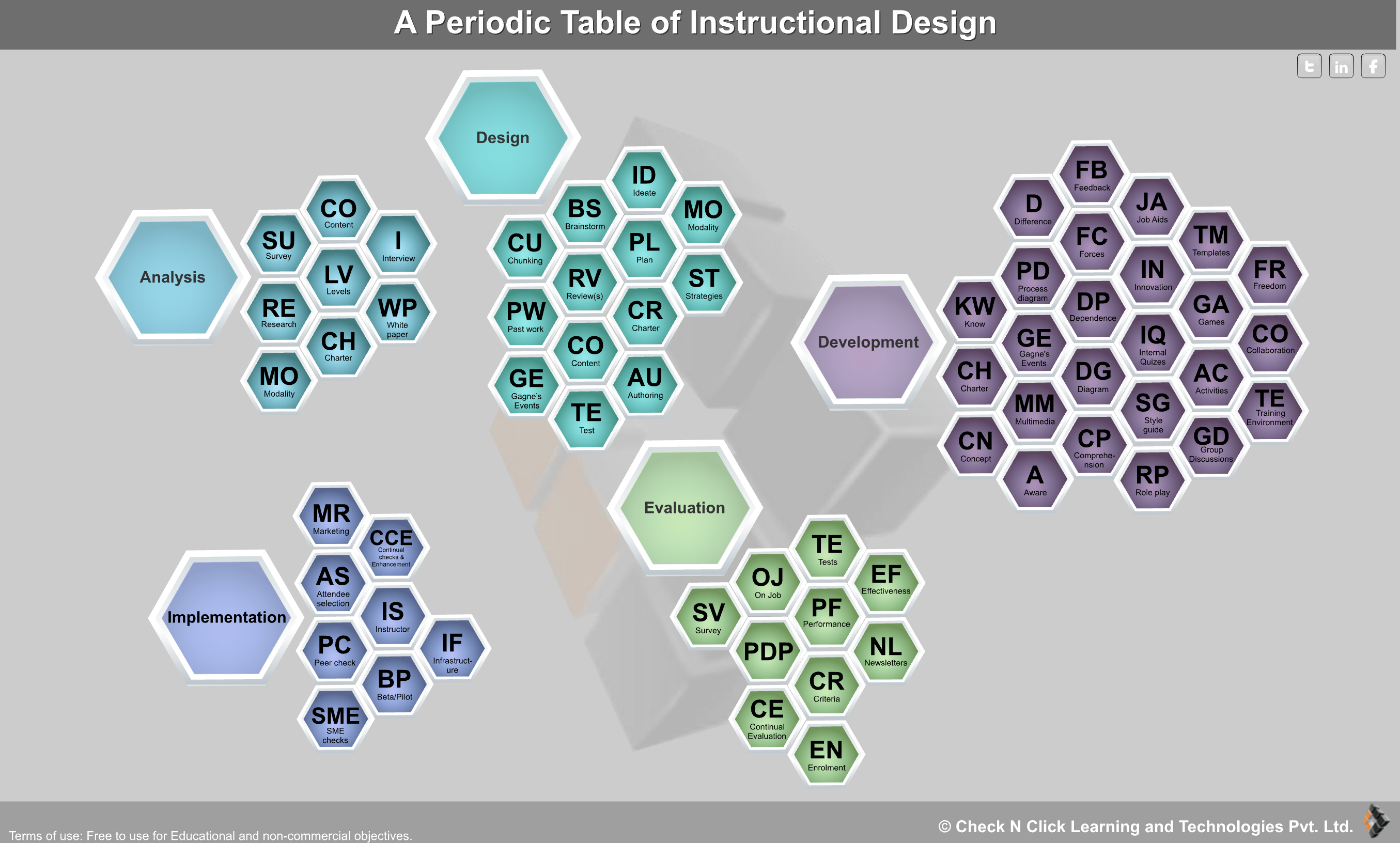
1) A Periodic Table of Instructional Design
From the stories you weave and the games you design to the words, colors, and images you use, sundry elements come together to create a seamless eLearning course. It is just like baking a cake. You have to use the right ingredients and in the right amount. You cannot throw just about anything into the mix and hope that the cake will turn out tasty.
As an eLearning designer, you need to remember (you already know about them) all the elements that go into the making of a great design. It definitely helps if these items are listed somewhere you can quickly refer to. Keep this interactive table handy; it categorizes the elements based on the guidelines of the ADDIE development model.
Here's a screenshot of the table. Click on this link to interact with the table.

Here’s another table that groups the instructional design elements according to their relevance to the different developmental phases.
2) How to Effectively Evaluate E-Learning
Perhaps you’ve been here: Amidst pressure from colleagues or employees, or after reading an online article about training trends, you took the plunge. You started an eLearning program at your organization — and then watched with dismay as it fell short of your goals.
You have to stop doing this! Don't accept "not-so-good" eLearning courses as a solution to resolve a training need. This will only keep perpetuating a negative stereotype of eLearning programs within our company.
To combat this, Steve Yacovelli has created this helpful checklist to help us evaluate our online learning courses.
Check it out: How to Effectively Evaluate E-Learning
3) Storyboard Templates
The storyboard is the roadmap that keeps eLearning designers on the same page and guides them through the plot of a scenario, the logic running through a game, and the visual theme of the course. An eLearning storyboard is like a lesson plan but more expansive in scope. A storyboard doesn’t only lay out the content overheads; it also describes the graphics, videos, and how the scenarios and the games will evolve.
Storyboards make the design and development processes efficient by removing ambiguity and letting designers visualize how their ideas will play out. These advantages translate into rich, engaging, and memorable learning experiences.
Check this repository of storyboard templates. You can tinker with the features and create templates of your own.
Also download this template we've created.
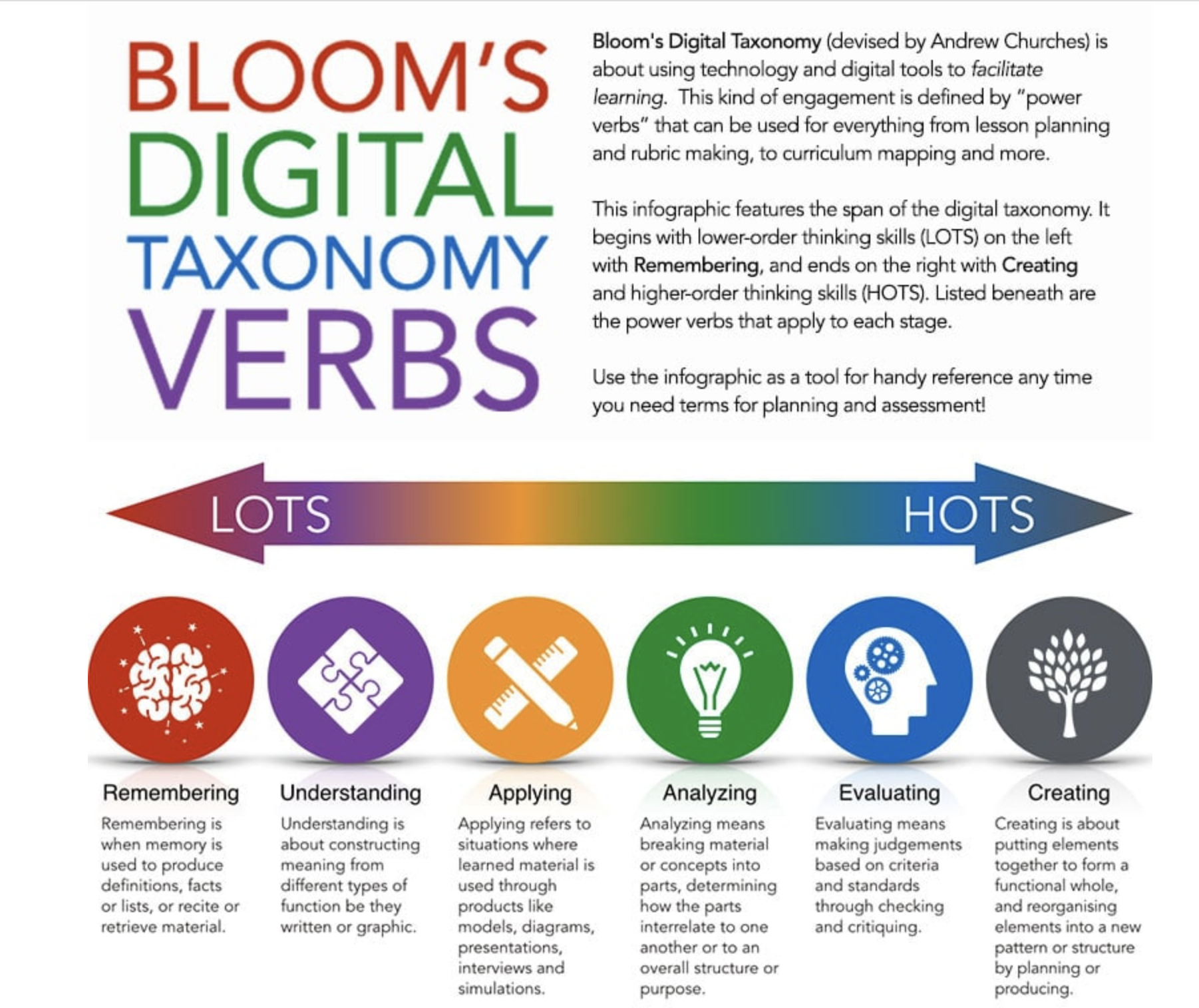
4) Bloom’s Taxonomy of Verbs
This infographic on Bloom’s Digital Taxonomy of verbs progresses from lower-order (LOTS) to higher-order thinking skills (HOTS) and covers all stages of the taxonomy. You can refer to this resource while planning lessons, creating assessments, and designing rubrics.

Download the complete full version here.
5) Quality Check for Your Courses
Don’t settle for anything less than excellence. Also keep in mind that not every professional developer delivers excellence or flawless products. It 's hard to make out authentic genius and professionalism from the mere tall claims. So here’s a checklist to help you evaluate a course for quality, relevance, and value based on the following typical parameters (or the pitfalls, sinkholes, and minefields that many eLearning developers are unable to avoid):
- Ambiguous navigational structure
- Poorly chunked and improperly sequenced content
- Text heaviness that is overwhelming
- Visual design that increases the cognitive load
- Inadequate scenarios that fail to create relevance
- Insufficient activities and problem-solving activities
Download this 3 page Checklist to Assess the Quality of an E-Learning Course.
Also, read this post on how to go about the quality check process.
6) Training Needs Analysis Questionnaire Template
The first step of bringing about positive and lasting change is to carry out needs analysis. In the context of corporate training, you have to determine the gap between the current level of skill and knowledge and the desired level of performance the organization strives to attain.
A thorough needs analysis also identifies the relevant training areas. This ensures your efforts are not wasted, and learners perceive the training as being relevant and are motivated.
Below are the links to some questionnaires and surveys that will help you carry out a training needs analysis for your course:
-
- This repository contains training needs analysis templates for various industries.
- This template will help you create a training needs analysis questionnaire.
- These sample questionnaires will help you create effective surveys.
Now here’s a disclaimer. Not all pre-made questionnaires will fit the bill. Organizational requirements are too diverse. Target audiences differ based on demographics and the roles they have to play in the workplace.
Before using a pre-made sample survey, make sure it is relevant to your target audience and the organizational requirements. You may also want to create your own survey based on an existing one. Be sure about the purpose of the survey and what you wish to analyze. Do you want to find out what the audience already knows? Do you want to know what skills they have to acquire to move to the next rung of the corporate ladder? You need this clarity to create new questions or customize existing ones.
Having this clarity of purpose will also help you find the best solution to bridge the knowledge and skill gap of employees. And, the best option might not always be an eLearning course. For instance, the reason for workers not being productive at work might be a lack of sophisticated machinery and not their lack of competency.
7) eLearning Style Guide
The eLearning Standards and Style Guide helps ensure consistency across the course or a particular series of courses. It is a ready reckoner of sorts that helps multiple designers maintain stylistic consistency for elements like, but not limited to:
- Font, font size, and typeface
- Image placement
- Choice and preferred spelling of words
- Usage of abbreviations and acronyms
- Course and module lists
- File naming conventions
A style guide not only helps designers create courses with harmonious look-and-feel but also speeds up the production and delivery process by reducing rework. Additionally, having a style guide in place helps new team members get into the groove quickly.
Here is another template for an eLearning style guide. And here’s another.
8) eLearning Audience Analysis Template
You create courses to help your audience acquire knowledge, learn new skills, and adopt healthier and productive work practices. However, you just cannot dump content on them. To ensure your course resonates with them, you have to deliver your message taking into account their education level, prior knowledge, beliefs, and learning preferences.
Adopt an audience-centered approach when you create your course. Carry out a thorough audience analysis to identify your audience and know how, when, and where to deliver your course. We are sharing our eLearning audience analysis worksheet here; it is free.
So there you are. We have listed the eLearning worksheets, templates, checklists, and cheat sheets that will help you be more productive at work. Download them, print them, and post them where you can refer to them frequently. They will help you remained ordered in the midst of chaos and deliver flawless products without slips and misses.


