It can be overwhelming to sit down and create an eLearning course. We know it’s tempting to jump straight to developing your eLearning course. But, hold back the authoring tool for now! There are tried and true steps to take before firing up that authoring tool.
How will you make your course interesting, relevant, and useful to your audience? How will you engage them and grab their attention? Spending time planning is key.
Below are three techniques that can help everyone on your eLearning team get on the same page and address the icky aftermath of the brainstorm. In addition to helping you streamline your course development, these three trustworthy tools will help you plan your eLearning content with much more efficiency to get out the right message to your learners.
Each of these helpful resources invites collaboration in an effort to reach a well-rounded version of everyone’s expectations. Read on learn how to start applying them immediately in your eLearning projects.

1- Showing is Better Than Telling: Prototypes
How many have ever heard this phrase, “It looked different in my head.” Much work goes into pulling an idea out of your head and putting it on paper.
Would you try on jeans before buying them? No, because you don’t know how each pair is going to fit until you see it on your body. Very few things are like we imagine them to be.
If your team has discussed the course, you will know what you expect. The thing is, so will everyone else. The project leader, the engineer, the programmer, the designer, and everyone else on the team will have their understanding, and it’s not until you see a sample that everyone can compare notes.
An idea has to be put down for everyone’s expectation to meet. Being able to visualize a course and the interactions will be a lot more useful than “hearing about it.” This difference in perspective is why creating a prototype is the ideal next step to the brainstorming phase.
Prototypes are an early model of what your eLearning course of the look and function. The prototype will display the basic map out the interactions, text, and graphics included. Your team and/or clients will get a chance to evaluate and discuss each item that the learner is destined to experience.
So, now that you know why it’s useful, where do you start? To build a prototype, you can use Powerpoint or ideally your authoring tool. Either of these will allow you to create a format that will help you visualize the experience part of your course. It will bring up questions and feedback that will lead to optimizations.
Issues such as "Couldn't I have done this?" and feedback like, "This could have done in another way" can lead to “aha” moments that save a lot of work later on. This is why this resource must be done collectively so all points are evaluated holistically. The courses’ response to learner decisions and choices is a critical part of the design phase.
Your good idea has invisible gaps until someone is able to engage with it. It will go from a "perfectly imperfect" rendition to a more practical, usable version of your course.
Read more: The Ins and Outs of Rapid Prototyping for eLearning
2- What's Your Vibe: Moodboards
If you have ever been on an eLearning team project, you have learned that when one person uses the word “yellow” not everyone in the room is thinking the same thing.
This design exercise is used to get everyone on the same page. The collage of photos, styles, words and object help identify the elements that go into creating the essence of an idea. Think about it. If every screen of the course has different color schemas and fonts, it does not foster a continuous learning experience. The other negative of not having a consistent course design is that it does not speak to the brand of the company. A great eLearning course design will cause immediate association with the company for learners. This is crucial for connecting emotional affinity to the course.
In your case, a mood board for an eLearning course would include theme, color scheme, guidelines for images and videos, as well as the graphic elements featured.
Here are a few listed out for you to add:
- Theme colors
- Voice
- Pictures, charts, and graphs style
- Selected fonts (specifications to placements, size, and colors)
- Navigation Interface (buttons, roll-overs, and text captions)
The moodboard is a starting point for some challenging and fun brainstorming. Much like the prototype, these exercises will bring up questions, tweaks, and discussions on each. Sharing and applying feedback will allow your team to advance in your aesthetic vision of your design.
You’ll find most looks evolve as you tweak options. Editing is the critical piece of the mood board, being able to add or remove components easily. Experimenting is required for it to be a fruitful exercise in the development process. Removing a color, you first considered will open the way for the perfect feel.
Once you’ve accomplished your desired “look and feel”, it will provide direction to officially start designing your eLearning courses.
Read more: Use Canva’s drag and drop editor to create amazing mood boards
3- What's Your Content's Flow: Storyboard
The key to any story is structure. Organizing your ideas allow the information to inform and the features to add value. Each component’s worth stands clear and appreciated by your learner. Prepping a storyboard will structure content and help you accomplish this.
A storyboard is a sequence of scenes. It is a reference to each lesson, screen, and feature of your eLearning course design. Missing components will become visible when you define what will there be in each screen exactly.
Here’s our friendly breakdown on getting started:
- Custom Made: Create your own eLearning storyboard template. Yes, you can search for free storyboard templates on the Internet! But when you decide to grab one, use it as a base, and personalize it. Just avoid using standard formats that might limit your creativity. Instead, try to tailor it to fit the specifics of what you envisioned.
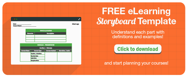
- Anatomy: Whether you decide to use a template or create your own from scratch, you’ll want to include the following elements for a complete story. Providing each of these will give your team a wholesome understanding of all the components.
- Header/Title: Project name, Course name, Date, and all other identifying information you need to keep your storyboards sorted.
- Screen Text: The text, in full, as it appears onscreen. Include instructions that students will see, like "Click NEXT to learn more". This lets subject matter experts see exactly what will be presented.
- Audio: Narration that goes along with each screen (plus audio notes).
- Navigation/Interaction Instructions: Everything a learner can or should do on the screen. This is a big one, but it's important for everyone to know how the lesson will be interacted with. Include any interactive trees like quizzes, along with different responses that will display. Also make sure to specify how learners get from this page to the next one. Programming logic form can be a good asset here: use if/then statements whenever possible.
- Graphic/Media: Images or animations, as well as their positioning on the screen. You can even think about adding thumbnail sketches in place of images rather than describing them verbally.
Must read: A Simple Guide to Creating Your First eLearning Storyboard
Use some of the following tips when advancing to the next stages of the Storyboard exercise:
- Before applying changes, make sure you shared the eLearning Storyboard with all the right people for all the proper feedback. You need to have others review your storyboard. Does everything make sense? Does all of the content matches with your one or two big ideas. Make sure that other people see alignment in the course. If alignment is missing at this point, it is easy to figure out where in the course sequence something else needs to be done. This is much harder to see when you are actually in the authoring tool.
- Stay focused on the information that you choose to include. eLearning storyboards describe the needs of a course. Forget about tools. If you are well versed in the functions, the Authoring Tool can provide, keep them in mind or place them in your notes for future application.
Also read: A Practical Guide On How To Start With eLearning Storyboards
If you’ve prepared all the content and drafted the learning outcomes, these techniques will make sure that all of your efforts to assemble your course design will not be in vain. Starting from scratch can get overwhelming but frustrated can double down the line. Don’t jump straight into the Authoring tools before going through each of these exercises with your material.


