Well-design courses are worthless if they can't communicate content effectively to those learning. Truth is, effective communication is actually more challenging to apply especially in designing eLearning .
Optimized eLearning design has the power to motivate students and drive performance. If you are serious about creating effective eLearning courses, it is essential that you follow all four of the following steps to get the right message across to your learners.

1. Favor Simplicity Over Complexity
The “Keep it simple” approach is typically used in marketing; however, it applies equally well to effective eLearning courses in terms of both design and content.
It is unlikely that learmers are taking your course to appreciate your ability to create an aesthetically pleasing design. They will get much more enjoyment from your course if you remove elements from your screen that add nothing to learning but do cause distractions. This includes borders, shading, and any images that do not help learners better interpret a message.
In terms of content, simplicity means presenting what could potentially be highly complex ideas in the most straightforward way possible. Learners will find it far easier understand and remember information if you stick to only the detail you need to convey your point. Graphics, particularly diagrams, charts, and illustrations, are a greater way to achieve this in effective eLearning courses.
2. Don’t Make Learners Think!
Applying the principle doesn't mean students are not allowed to think while taking the course. It only means that your course’s interface is obvious, self-explanatory, and intuitive.
To rephrase Steve Krug’s usability mantra for our purposes: “Don’t make me think about the interface, because I need to be thinking about the learning.”
Learners should never have to work to find their way around your course; features must be obvious and self-evident. Intuitive navigation, visual cues, and conventionally-named links will lead your learners to the right areas of your course, minimize cognitive load, and enable instant gratification.
In short, don’t let learners guess, ask or puzzle over how to do things.
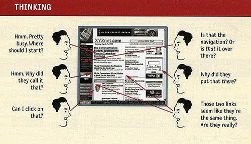
According to Krug, when learners are looking at a screen that makes them think, this is what happens:

Image Source: Steve Krug, Don't Make Me Think
3. Manage to Focus Learners Attention
Optimize every moment in your course for grabbing students’ attention and enable learners to transfer information to their working memory. At each moment of your course, your slides should only contain information that is necessary. Remove anything that tries to win your audience’s attention. For instance, the placement of text, color contrast, graphics, font size, pace, and mode of delivery (whether audio, video, or animation) all have an impact on attention. As people are instantly drawn to novelty, patterns, and motion, utilize these aspects to create focal points.
In addition, exploit peoples’ natural tendency to scan content by highlighting the relevancy of your content and encouraging learners to read on. You should place key information in the first two paragraphs, use clear subheadings that explain what is to follow, and split content up with bullet points.
Finally, begin every course with a brief summary that explains what students can expect to learn. This will help students make an informed decision about whether modules are relevant, useful, and within their abilities.
4. Use Effective Writing Techniques
Well-written content is the most important factor that separates a engaging course from one that bores learners.
If you are used to writing content for print materials, you will need to adjust your writing strategies slightly in order to create content for effective eLearning courses:
- Get to the point ASAP. Use short, concise phrases that express your point quickly in as few words as possible.
- Talk to your learners. Address learners directly to create the idea of conversation rather than instruction.
- Organization rules. Present information in a logical format and split content up using headings, lists, bullet points, and visual elements to avoid solid blocks of text. Remember that screen after screen of bullet points are equally demotivating.
- Lose the BS and make content interesting. Write content that learners can relate to, use emotion to help students connect with the material, and focus on subjects that learners will find interesting.
Once you have finished writing your content, go back and cut out anything that is not essential to your course. Eliminate unnecessary background information and history, edit out fluff adds no value to content, and make sure you are not tiring learners with your overuse of adjectives and adverbs.


