If you had not been living under the rock (read: away from the Internet), you know infographics are everywhere. They are on websites. They show up on whitepapers. They are in the ads. They are splashed all over newspapers. But of course, there are plenty of good reasons why content creators use infographics. These stunners are also excellent learning tool. Most human beings are visual learners. As eLearning designers, you too should tap into the immense instructional potential of infographics.
But before you blindly jump on the infographics bandwagon and splatter your course with these visuals, make sure that you stock up on information about how they work and when to use them. Badly-designed infographics or placing them out of context can increase the cognitive load of a course. So here's the lowdown on infographics.
When to Use Infographics:
We digest complex bits of information more easily when they are represented visually.
Here's a rule of thumb for using infographics: Use infographics when you think the information on screen can be best understood using visuals.
The following types of eLearning situations lend best to the infographic treatment:
- When you have to tell a story that spans across time. Journeys across time make for interesting infographics. These contain a timeline of events that helps learners figure out the relationship between various incidents as they occur over a specific span of time. For instance, you can plot the growth of business, the life history of a person, or the progression of sales across months or years in a chronological timeline. A bar chart is the simplest instance of an infographic that depicts the relationship between events across time.
- When you have to compare and contrast data. Remember in school how we used to draw up tables and wrote down information—like the amount of rainfall in different places—in side-by-side columns to compare them? Or think of the product reviews that various websites put up. They list the features of similar products from different brands and place the lists side-by-side, so drawing parallels is easy. These are examples of infographics, the best way to represent similar data that needs to be compared.
- When you have to associate or connect concepts. You should use infographics to help learners fathom the relationship between events across time (growth of revenue), space (population figures in different countries), or categories (the percentage of various food groups in the grocery shopping cart of a family).
- When you have to explain a process. Infographics let you break down complex processes into their simpler components and represent these visually and sequentially for easy understanding. Technical subject matter, like describing the workings of electronic equipment or the assembly line of a production unit, can be best expressed using an infographic.
When NOT to Use Infographics:
Infographics are exciting. They jazz up your course like no other element can. But beware of overkill. It takes effort to create graphically-rich infographics. Do not waste time and resources to create infographics if they are not the best instructional media for a particular type of content.
Do NOT use infographics in the following instances:
- When a simpler graphic will suffice. If a graph or simple bar or pie chart is as instructionally effective as a more effort-intensive infographic, go for the former. Most learners will be happy to have understood the content; they do not have to be wowed always.
- When you are dealing with disparate pieces of data. Do not try to create connections between data where none exist. This creates confusion and increases the cognitive load. Besides, not all pages in the course have to contain an infographic!
- When you have to tell a linear narrative story. The best way to tell a linear narrative story is to just get on with the storytelling and rely on language to evoke emotions and create tensions. A linear narrative is a simple story structure with a definite beginning, middle, and end that follow a line. It can be understood and appreciated even if it is not represented as an infographic.
- When you want to use them just because they look "cool." The ultimate pitfall. Steer clear of the temptation.
6 Tips to Create Effective and Stunning Infographics:

Keep the following tips in mind to create instructionally effective and visually stunning infographics:
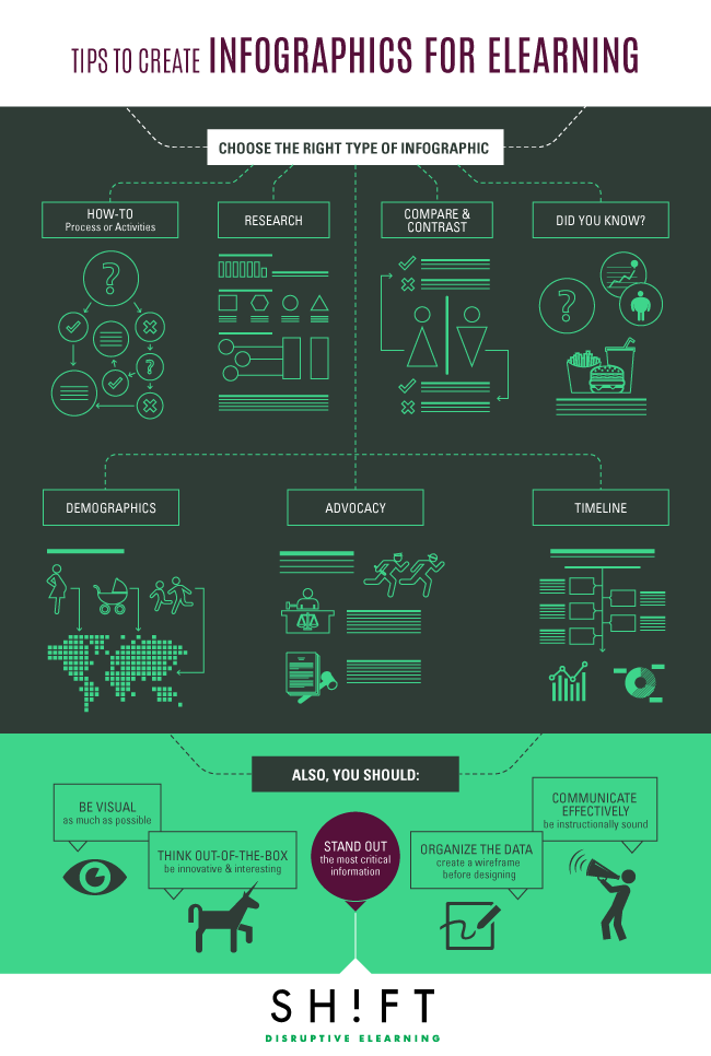
- Choose the right infographic according to the content. There are eight main types of infographics: How-to (Process or Activities), Research, Compare and Contrast, Did You Know, Demographics, Advocacy, and Timeline. Choose the one that befits your content and the learning outcomes. Choose the type where you can express all relevant data (show but don't tell), so the learner can arrive at his own conclusions just by glancing at the graphic.
- Be visual as much as possible. Pare down on the text and use visuals—icons, images, or symbols—to represent the data. After all, the infographic is a visual medium.
- Think out-of-the-box. To create an impactful infographic that sticks, you have to innovate. For instance, think beyond the conventional vertical flow paths, introduce a shock element in the headlines, and draw interesting and unconventional parallels.
- Make the most important pieces of information stand out. In your quest to be creative, do not design clutter where the most critical pieces of information are lost in a maze of colors and icons.
- Create a wireframe before getting the graphic artists on board. Creating a wireframe lets you organize the data in hand and figure out the most critical pieces of information to include in the infographic. There are a slew of online tools that let you create your own infographics and tinker around with the design and layouts.
- Communicate effectively. An infographic should appeal to the tastes of your audience, be instructionally sound, and help the learners remember information easily.
CONCLUSION:
We are not only visual learners, but we also have short attention spans. We want to be able to consume and digest content in a jiffy. This is why, infographics have caught on wildly. When you use infographics in your eLearning courses, you actually dish out content in a way your audience appreciates.
Amazing resources you might want to check out:
- So, you want to make an infographic? Here's the process behind infographics.
- Free Vector Infographic Elements Kit
- 5 Infographics to Teach You How to Easily Make Infographics in PowerPoint [Free Templates]


