We are carrying on with our series where we decode the science of forgetting. We peek inside the human brain to decipher why learners forget your training. The knowledge will provide you with valuable insights on what to do to create memorable eLearning courses.
The modern corporate learner is overwhelmed by a constant influx of stimuli and information. Employees have to relentlessly sift through a sea of information to sort the facts from the fluff. They have to carry out sundry personal and professional responsibilities. They also want to work on their dreams and cherished projects. They basically have too much going on in their minds. Their attention wanders and they can't focus on the learning as much as they would have liked to.
Of course, you cannot control the thoughts racing through your learner’s mind. But you CAN control how your course progresses and the way the content is presented to make it stand out, arrest attention, and bore its way into the memory.
In the previous post, we identified and talked about the barriers to retention and how you can create opportunities for deep learning by removing these pitfalls. Deep learning establishes the relevance of your course and keeps learners engaged. These, in turn, improve retention.
In this post, we will focus on the other pitfalls that hamper retention and put the brakes on learning effectively. We will also provide you with tips to help you negotiate these barriers.
Forgetting Reason #2: Encoding Error or Absence of Attention
Solution: Create a purple cow.
The most common reason for forgetting is not paying attention. But don’t blame the learners for letting their minds wander instead of concentrating on your course.
Attention is a complex phenomenon:
- Our attention can wander voluntarily or involuntarily.
- Our attention span is shorter than a goldfish (8 seconds!)
- We think we can be attentive for as long as we like, but the truth is that we often overestimate our ability to focus.
As an eLearning designer, you have to not only hold your learners’ hard-to-pin-down attention but also compete with distractions like pop-ups that dance on the screen and beckon to be clicked, and blinking and beeping smartphones to make your content stand out and command attention. And then there are sundry thoughts that flood and run through your learner’s mind.
How do stand out from the competition? Make the most critical content stand out by differentiating it from the adjacent elements. To use Seth Godin’s phrase, you have to "create a purple cow to stand out in the midst of a sea of content."
This means that to turn heads, grab eyeballs, and hook learners right away, you have to create a focal point (purple cow) on the screens of your course that are full of various textual and graphical elements (a field full of brown cows).
The idea stems from the countryside. Imagine you are driving on country roads lined by grassy fields. The fields are teeming with brown cows, each one no different than the next one. As you continue to drive, the brown cows seems to melt into a blurred mass, and you no longer notice each animal separately. But then you turn a corner, and suddenly find yourself staring at a purple cow. You are jolted out of your stupor. You stare and stare at the purple cow, taking in all its details. You drive away, but the memory of the purple cow remains etched in your mind. It is an unforgettable image because it is unique.
Now translate this analogy into your course. If every screen looks similar, your learners will soon fall into a dazed stupor and fail to notice anything in particular. Nothing will register on their minds as they click away page after page. Now if you have a focal point on the screen, they will notice it right away and pay attention.
Here are some ideas on how you can incorporate a focal point on the screen:
- Introduce an element of surprise once in a while, without disrupting the harmonious look and feel of the course.
- Add a touch of inconsistency to spice up things around the screen. This would be the point of interest on the page that will hook learners. This post on visual consistency contains tips on how to incorporate inconsistency while maintaining visual harmony.
- Employ Exaggeration (of course, with moderation) to liven up your course. You can use exaggeration in the outcomes of scenarios, physical appearance and emotional characteristics of the characters, and images to make your course less ordinary. Understatements are also powerful forms of exaggeration.
More attention grabbing tips in these posts:
- 10 Things That Learners Pay Attention To (And How to Use Them in eLearning)
- Attention-Grabbing eLearning Design: 5 Techniques You Should Try
- Use Power Words to Grab Your Learner's Attention
Forgetting Reason #3: Dead from Disuse
Solution: Repeat. Repeat. Repeat.
If you are an eLearning designer, learn about the Decay Theory to understand why your learners forget your mindfully-created and lovingly-crafted courses. According to this theory, we tend to forget information that we don’t have to recall and apply often.
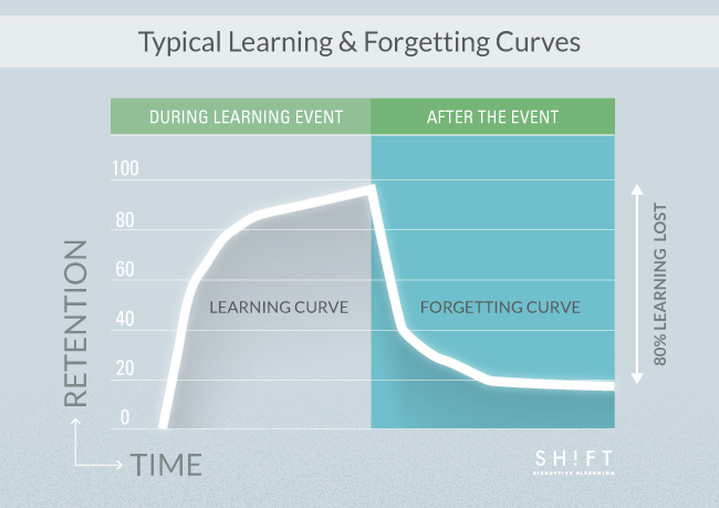
Numbers don’t lie. Researchers have plotted the rate of forgetting on a graph to find out more about the forgetting curve. The results come as a frightening eye-opener for the eLearning designer who had all along thought that more content he or she crams into a course in one single learning event, the more helpful and relevant the course becomes. Wrong! We tend to forget as much as 80 percent of all new information we have learned within a few days after the learning event has occurred.

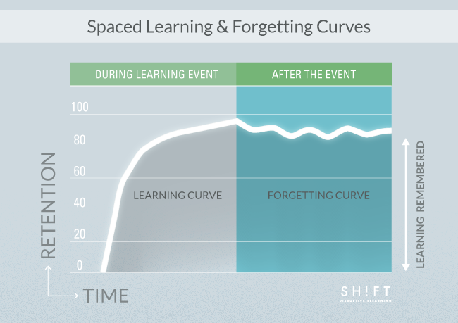
The forgetting curve has a steep downward slope. The slope is explained by the Theory of Disuse that emphasizes the role of spaced repetition in learning and states that we forget because we do not go over the matter after learning has occurred. According to this theory, spaced repetition reinforces the learning and cements it in the long-term memory. Actually, it can improve long-term retention by almost 200 percent.

The human brain is a supremely efficient organ. It notices that some pieces of information (stored as memories) are lying unused for a long time. So it throws these bits of data into a pile and stores them in the attic to clear space in the short-term memory for information that you need to retrieve regularly.
Therefore, we can say spaced repetition is the key to retention. You have to ensure that your learners have ample opportunities to apply and use what they have learned in your course.
Here are some tips on how to make repetition work:
- Make sure that you represent information in different ways throughout the course. For instance, you can present a chunk of information as a chart in one module and then design it as an interactive activity in another module.
- Space out the training to prevent information overload. This is especially necessary for courses that contain a lot of information. Taking time off between training sessions allows the material to be cemented in the brain. Here is a post on how spaced learning scores over crammed learning in all aspects.
- Exploit the innate advantage of online learning. Allow learners to access the modules at the time and place that is more convenient for them. This will encourage them to go through the learning at their own pace.
- Design a follow-up schedule. Create post-training activities that will let learners apply the learning or send across refresher information nuggets to reinforce the material. Throw in a poll, an infographic, or a reflective question into the mix to keep things interesting.
- Plan on-job training sessions to create opportunities for learners to reinforce the material at the point of need.
Interested in reading more?
Here is another resource to help you create unforgettable courses: The Seven Rs: Learning Beyond Content, a post on creating an environment that supports learning.
You may pack your courses with tons of relevant content, but if they don’t make a dent in the learner’s mind, they have failed in their purpose. Don’t waste the learner’s time. Don’t let your efforts go down the drain either. Make sure that you apply the strategies we have mentioned in this post.
You pour much love and sweat into the courses you create. Ensure that they don’t turn out into run-of-the-mill, thoughtless, and unremarkable works that don’t etch an impression in the minds of the learners.


