It's no secret that colors have an enormous influence over our perceptions of daily life—consciously and subconsciously. For example, warm tones stimulate and energize our senses, while cool hues bring in freshness and calmness.
This means that we as eLearning designers need to make sure we understand what it takes to make good color choices. A little color psychology may be the secret sauce to produce soothing and productive moods in your learners.
In this post, we will briefly discuss how you can use cool colors to your advantage when designing your eLearning courses.

Cool Colors
The range of cool colors is varied – green to yellow and violet. The coolest of all is blue. They are more subdued in their appearance; hence they belong to this family. These shades mostly remind us of nature, water, space, and sky. They are usually used against the sharped hues to provide a trustworthy, professional and harmonious combination. Among other things:
- The cool color palette has far-fetched applications. These colors are easy to look at and put the mind at ease, which helps while learning or grasping any new subject.
- They help in creating a crisper design that leads to a calmer and positive feeling among the learners.
- When designing eLearning, preferably use cool colors in the background and use warmer colors on elements you want to emphasize on the screen.
How to use cool colors in eLearning?
Lets take a closer look at how cool colors can influence your learner's mood:

1. Blue
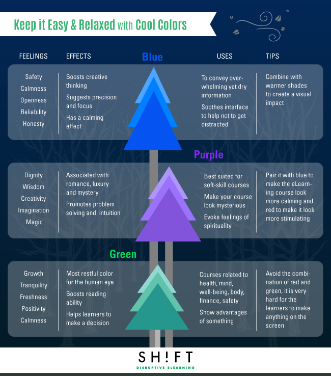
This color stands for simplicity, clarity, and efficiency. It promotes safety and calmness. The darker shades of blue reflect openness while the lighter hues aid concentration and promote reliability. The shade of blue is said to be beneficial for both the body and mind and epitomizes honesty and virtuousness. Research also proves it has the ability to encourage us to think outside the box and be creative.
While creating eLearning courses, it would be good to use this color when you:
- Want a course to seem calm and logical (but be careful, using too much of it can create a cold feeling).
- Need to calm the mood of your learner while explaining a complicated subject.
- Are conveying overwhelming yet dry information.
- Need to create a soothing interface to help the learner not to get distracted.
- Suggesting precision when speaking of high-end products.
Recommended color combinations:
When blue is used together with warmer shades like yellow or orange, it helps in creating a high impact on the learners with its vibrancy and cheerfulness.
2. Purple
This color promotes romance, luxury and mystery. Purple is the combination of energy (from the red color) and stability (of blue). It is most often associated with dignity, wisdom, creativity, imagination and magic. The stronger shades are most often associated with romance and spring while the darker ones with mysteriousness and luxury.
Experts in the topic suggest that purple color is best suited for soft-skill courses. However, it would also be good to use the shade of purple when you want to:
- Stimulate and promote problem solving, intuition, creative ability.
- Enhance the imaginative ability of your learners.
- Convey luxury or the finest quality.
- Make your course look mysterious or want your learners to solve any mystery and discover the information for themselves.
- Evoke feelings of spirituality and observation.
- When creating course for women, light purple is a good choice.
Recommended color combinations:
Purple can be easily paired with other hues to emphasize a particular mindset or mood. For instance, you can pair it with blue to make the eLearning course look more calming and red to make it look more stimulating. Also try blending it with natural colors like delicate greens.
3. Green
Green is the most restful color for the human eye. This color epitomizes growth, tranquility, and freshness. Since it is the color of earth as well as growth, it conveys feelings of positivity and calmness. For most eLearning courses that cater to the “Environment” subject, this is the most preferred color for the fact that it is easier on the eyes and relaxes our muscles and simultaneously, deepens breathing.
Green is also particularly suited for courses related to health, well-being, fitness, mind and body, finance, safety, and also corporates that mostly focus on revenue and prosperity. Recent studies have also pointed out that this shade promotes and boosts your reading ability.
While creating eLearning courses, it would be good to use green when you want to:
- Strike a perfect balance and harmony in your design.
- Bring out the benefits or advantages of selected products or features.
- Reflect feelings of freshness and honesty.
- Darker shades of green are commonly associated with finance and safety, so it’s a good color to use for courses on those topics.
- If your content is one that makes employees anxious, adding a shade of green can help your learners feel more relaxed. Using green promotes a sense of relaxation in their daily routine, inviting learners to take the course.
Recommended color combinations:
- Green and yellow is believed to be a combination of happiness and vivacity.
- The combination of red and green, however, clashes and is very hard for the learners to make anything on the screen.
- Check out these green color palette ideas.
CONCLUSION:
To sum it up, the idea is to use a combination of warm and cool colors. In order to strike a fine balance and maintain the coolness, however, you need to use a greater percentage (80%) of greens, blues, violets, and approximately 20 percent of warm colors including yellows, oranges, and reds.
How are you incorporating warm and cool colors into your eLearning courses?


