We remember the scenes and dialogs from some movies long after we have seen them. Some songs continue to haunt us even though we have not listened to them for ages. We can still recite rhymes and poems we learned when we were toddlers. Do you wonder why? Or if you are an instructional designer, have you wondered how you can create such sticky courses? How can you create courses that learners will remember easily and recall effortlessly long after they are back at their workplaces? It is challenging because forgetting is natural.
Scientists carried out a test on some subjects who had to study textbooks, retain, and recall the information. The results were startling: after a day, the subjects remembered 54 percent of what they had learned and after 21 days, they remembered a paltry 18 percent.
But are you surprised? When we were in school, most of us didn't remember what we learned in the earlier grade.
As instructional designers, you have to create courses that are easy to remember and difficult to forget.

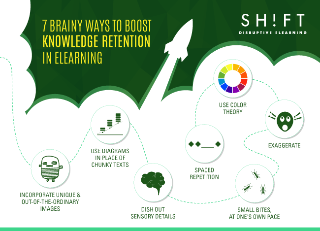
1) When possible, use diagrams
Human beings tend to better remember content that is structured coherently and has meaning for them. Using graphic organizers to create meaning is a tried-and-tested learning strategy that has been proven to aid comprehension, retention, and recall in learners.
Graphic organizers like charts, graphs, and diagrams are ideal for providing holistic views, expressing relationships, and identifying contrasting data. These help learners connect the dots, identify underlying patterns, and spot trends without needing to read through and make sense of many words.
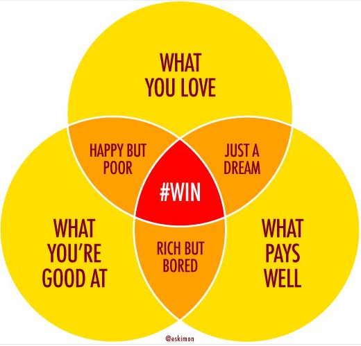
Some other common forms of graphic organizers are Venn diagrams, semantic maps, story maps, and character description maps.

Also read: These Are The Reasons Why Learners Forget Your Training
2) Add unique and out-of-the ordinary images
 We remember pictures more easily than chunks of texts or long lists of numbers. We also remember novel or unexpected images—the ones that jump out of the screen and hit our senses—better than staid, plain visuals. We remember the outrageously funny and the shockingly unexpected ads better than the ones that stick to formula. According to a study carried out in 2013, What Makes a Visualization Memorable, we easily remember data or content that is unique. The more unique and unsual the imagery, the better.
As instructional designers, you should strive to wrap information around a witty or shocking package (this makes it hard to forget). Do not risk letting your course fall into a design rut. Keep the element of surprise alive, so your learners are always on the edge of their seats, eagerly trying to anticipate what you are going to serve next.
Here are some other ways to break patterns to boost knowledge retention:
- Use infographics.
- Use different layouts to arrange and present textual content.
- Use unconventional images or symbols to represent common ideas and associations.
- Use audio or video content when images are too common.
- Incorporate emphasis and contrast with color or paragraph size for important course elements.
3) Dish out sensory details
The more the details in your content, the easier it is for the learners to create associations and remember better. The most powerful stories are descriptive pieces that paint vivid pictures with words to take us on journeys and stir intense passions in us.
When the amygdala, the emotional part in the center of the brain, notices that content has a high emotional value, it considers this material to be more important, therefore remembering this stimuli more easily.
Visuals—photographs, illustrations, and videos—help you add details to stark facts and data. However, words work as well. Use adjectives wisely, verbs to describe action, analogies, and comparisons to create memorable associations.
Also read: How to Drive Engagement with Emotionally Charged eLearning Courses
4) Use color theory
The human brain loves colors. Apart from being visually enticing, colors can also help the brain process and retain information more efficiently. According to the findings of several scientific studies, using colors to present content fires up the brain and stimulates intelligence across all levels, which in turn, forges more and stronger connections and aids memory formation and learning. Color can also be used to organize information more coherently.
Colors works on our brains in other ways as well. Colors grab eyeballs readily and keep us hooked for longer lengths of time. When we focus more on a (colorful) piece of content, we notice more details. This ensures a greater amount of stimuli reaches our brains and gets converted into long-term memory.
Colors also help people remember because they affect our moods and evoke emotions. Warm tones like red, yellow, and orange excite the brain and make content memorable.
Here is an experiment to convince you of the power of colors. Just read through the following piece of text, and you will get the idea.
When reading through a large chunk of content, the text in red catches the eye readily. Your mind simply refuses to register the text in some other colors. The crux of the matter is that you are more likely to remember bright colors because they grab your attention and keep you hooked for longer.
Read more: The Psychology of Color: How Do Colors Influence Learning?
5) Exaggerate
 We remember outlandish stories. The person who speaks with animated gestures catches our attention even if he is in a crowd. Caricatures of politicians in newspapers grab more eyeballs than their photographs. It seems that we are attracted by anything that is OTT. Exaggeration is also an effective ploy to create memorable eLearning content.
Exaggerated outcomes, images, exaggerated physical and emotional characteristics, and understatements are some effective ways to infuse life in dull eLearning content and keep the audience hooked to the course. For instance, you can jolt learners into action by painting a picture of a catastrophe that awaits them if they don't follow the tips you have listed in the course. Exaggerated images gain more attention, which is what we always want, right?
6) Small bites, at one's own pace
Your learners tend to forget things when you dump too much content at once. Therefore, an effective way to create short, succinct courses is to chunk content smartly. Chunking content means to break down and organize it into bite-sized chunks that are easily digestible. When you compress data and arrange it to create logical associations, it is easy for learners to process the information without burdening the long-term memory.
Chunking is also an effective way to shorten your course by doing away with all the fluff and only retaining information that is critical to the learning process. This, in turn, leaves you with less content to cram into a single session!
Remember, brevity is the name of the game. Think in terms of short, punchy sentences. Go in for crisp descriptions. Use a relevant graphic. Tug at the heartstrings of the learners to create meaning. By doing these your learners will have no problem remembering them.
7) Spaced repetition
Scientists have proved it—repetition aids learning and recall. New skills can be learned by repeating the actions needed to perform a task. We learn a new language only if we speak it often. Practice, indeed, makes a man perfect. So find out creative ways to repeat critical pieces of information throughout the course. For instance, if you have listed it once as bullet text, try including it within a dialog in a scenario or represent it with a chart on another slide. Also, try to build in retrieval practice, so learners can acknowledge if they have not retained what they've just learned.
Also read: Comparing Typical (Crammed) Learning vs. Spaced Learning
In an era when we are bombarded with oodles of information and stimuli from an assortment of always-on media channels, it is challenging to create memorable content. Hope these tips can help you in this mission!
Image Sources:


