You have most likely mastered the basics of instructional design already. Now it's time to learn an intimately related discipline called information design.
Put simply, information design refers to the “the arrangement of organization models to provide context and meaning for the information.” It comprises of several disciplines: typography, illustration design, page design, graphics design, communications theory, cultural studies, psychology, and other technical and non-technical practices. The goal is always clarity of communication.
The problem is, a number of common information design mistakes hurt that goal. Here are some of them:

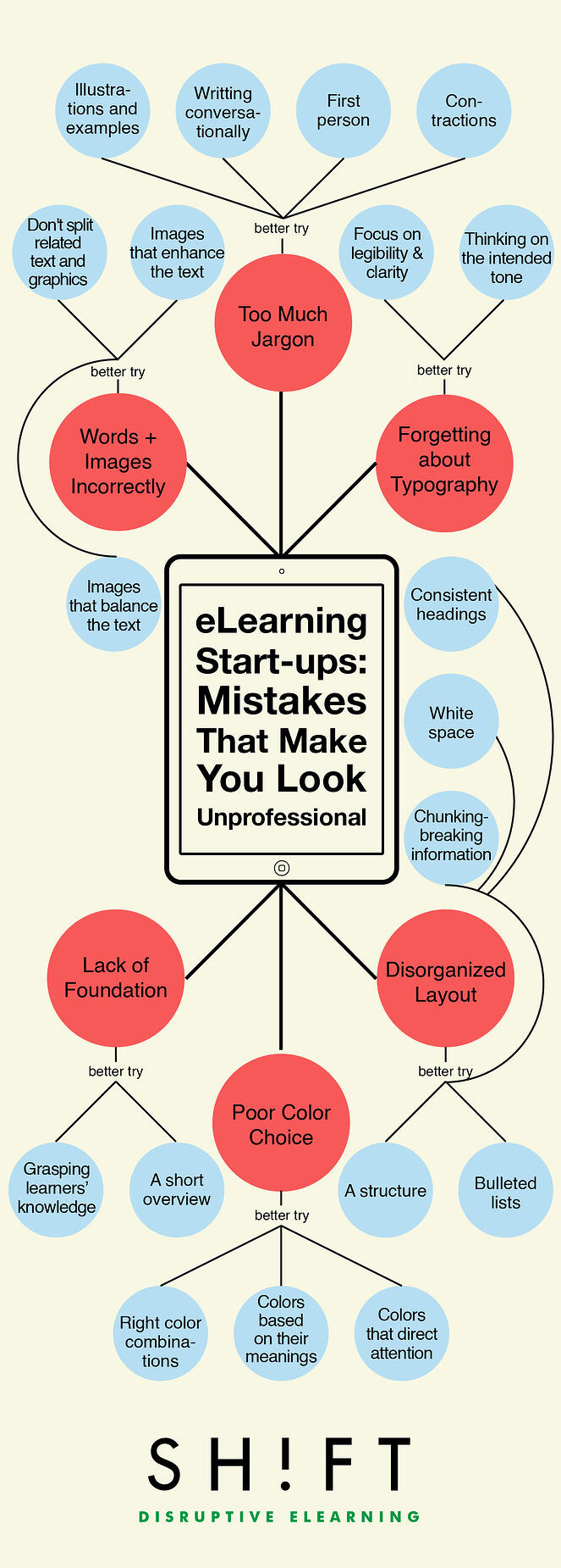
Disorganized Layout
One of the common mistake first-time eLearning designers make is stuffing large blocks of text into a screen. What they often don't realize is that how content is organized greatly affects reader comprehension. Learners are likely to feel overwhelmed with a poorly structured or cluttered material. They may skip important parts of it and even drop it. Most learners won't even attempt to read long texts that lack proper headings. E. St. Elmo Lewis, a pioneer of American Advertising, supports this idea in saying, “The organization of content directly affects our ability to receive a message. If the information appears jumbled and overwhelming, viewers will disconnect.”
Properly structuring your information on the screen not only attracts your learners. It also encourages them to pay attention to the most relevant information. In fact, a study by Lorch and Hyönä (2004), found that participants were able to read topic sentences with headings in less time than those without headings.
There are many ways to improve your eLearning content structure. Among them are:
- Creating consistent headings and subheadings
- Using white space around the text
- Chunking information or breaking them into smaller sections
- Using bulleted lists, indentations and diagrams to create a visual hierarchy
Poor Color Choice
Edward Tufte, a statistician known for his writings on information design, eloquently said this about color choice:
“Even putting a good color in a good place is a complex matter. Indeed, so difficult and subtle that avoiding catastrophe becomes the first principle in bringing color to information: above all, do no harm. ”
Color plays several crucial uses in the field of information design. As Tufte explains it: “They are to label, to measure, to represente a reality, and to eliven or decorate”.
Not Integrating Words and Images Correctly
Words and images go together. This lies at the core of information design. You cannot separate text from graphics, the visual from the non-visual (textual or oral). Though these are different devices, Tufte notes, both have a common purpose of clearly and effectively presenting information. Only by bringing them together, they enable you, the designer, to tell a good story.
In order to do this, you have to consider which images or visual elements would help readers understand your written content best. When integrating both explanatory text and related visuals, make sure they are located close to one another and on the same screen. Separating related text and graphics, even on the same page, can burden the viewer with the task of associating and linking the separate elements (Envisioning Information. 1990, p. 116).
Forgetting About the Basics: Typography
Typography is, in itself, a powerful discipline. It focuses on the readability or greater legibility of a text. Size, the type of the font, color, and spacing are all decisive typographic elements that will greatly affect the readability of your text. That's why every information designer carefully considers what typeface to use for the material. Hard-to-read scripts are a sure turn-off.
Formal research shows that the way we perceive information can be affected dramatically by how simple or complex the typography is. Check more about this study here.
There are basically to families of fonts to choose from: serif and sans serif. Sans serif is usually ideal for digital screens, while serif is deemed perfect for print. This, however, is not a definitive rule. To find the best typeface that suits your material, you have to consider the following factors first:
- Your audience's purpose for reading (is it for pleasure? or is it obligatory?)
- Your intended tone (is it academic? or casual?)
What typography truly boils down to is clarity. On-screen content should be clear and easy to read.
Adobe recently released a useful resource on typography, Typekit Practice. Be sure to consult when designing your next project.
Also check these helpful guides:
Lack of Foundation
It's impossible for us to design information effectively without understanding what your audience already knows. Do they have the right foundation with which they can absorb new information?
There are a variety of ways to supply a solid foundation. But the best way is to start with a short introduction or overview. In it, you should be able to explain what the lesson is about (the context) and how it's relevant to their goals.
Understanding their context will also help you organize a clearer content blueprint such as a table of contents, breadcrumbs, indexes, page numbers, and navigational tools.
Too Much Jargon
Tufte states that there is no substitute for good content. Basically, he believes that if your content is boring, you've got the wrong content. Word choices, for example, can either help you reach out to your audience or ruin an opportunity for engagement. You may not notice that the language you speak is unfamiliar to your learners.
The use of any jargon, abstract language or unfamiliar terminology disrupts people. It causes them to pause, then maybe consult a dictionary or entirely skip the term. This hinders them from fully understanding the content. It's not just about learners with limited vocabulary; even skilled ones tend to encounter complicated words and terms.
Avoid this mistake by:
- Using the first person
- Using illustrations and examples
- Using contractions
- Writing conversationally
Recommended resource: 50 Epic Jargon Solutions for Better Writing
References:


