Sure, anyone can design an eLearning course. The question is: how can you become a better designer?
Remember, we're now living in a world that's constantly inundated with information. Allowing people to learn from almost anywhere is no longer an add-on feature. To become a better designer, you have to understand fully how information works in a distributed or networked environment. And you definitely have to be comfortable when working with different tools and technologies too. But, above all, you need to stick to the fundamentals and don't get distracted.
These five commandments are what you, the modern eLearning designer, need to embrace in order to survive and succeed in today's dynamic and challenging world.

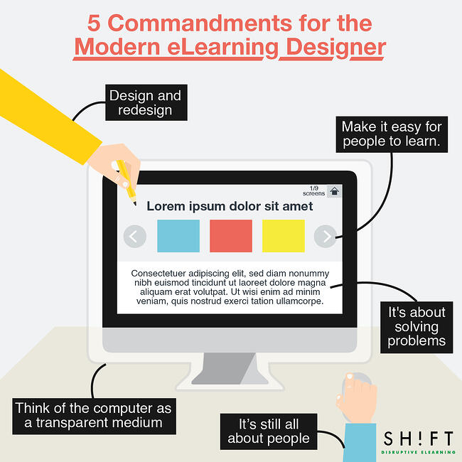
1. It’s still all about people. Get to know who you're designing for.
Max Levchin of the PayPal fame has something to say about user-centered design.
“You are not designing for yourself, and shouldn't be. Most people using the Web don't understand (most of) what makes it work and don't want to. Design for those people -- there are many more of them than you.”
This is a deceptively simple statement many professionals continue to ignore—at their own peril, of course. But highly skilled eLearning designers know better. In addition to their deep understanding of technology, they are also able to empathize with people. They know very well that eLearning design is more about how people behave, less about how the interface looks.
Strive to become a learner-centered eLearning designer and you'll most likely succeed. Don't ever attempt to design without having a deep, intimate knowledge of who you're designing for.
2. Think of the computer as a transparent medium.
Don't make it about the computer or the device or the learning interface. The medium has to remain transparent if you want learners to focus on the content.
Think of it this way. If you're completely absorbed in a story, you're turning pages without actually noticing the book's physical structure. You're simply interested what you're reading, nothing else matters. The same is true when you're enthralled by a movie that you hardly notice everyone and everything around you.
Good eLearning design does this too. Learners get to focus on the material or the task at hand—not on the interface, not on how to download a PDF, and definitely not on how the system works. This is what "intuitive" design is all about. It has to be familiar enough so that learners can get started on the course, and not think hard about how to do things.
3. Make it easy for people to learn.
People learn best when they're comfortably able to predict what's coming next. Can they navigate their way easily? Can they go back and forth or search a particular section without difficulty?
You don't need a master's degree to figure out how people use navigation systems. Look for general patterns. For example, people usually expect to see sections or pages on the uppermost section or the navigation, back and forward buttons for sliders, and recognizable (underlined or styled) links. They also expect to see the most promiment elements displayed first. There are plenty of other elements learners already expect to see you use in your material consistently. Therefore, you can harness what people already know and strive for consistency. Design experts suggest thinking about the way that you design all of the items in your screen, such as:
- Colour (focus, secondary colours)
- Visuals (imagery, photos, icons, buttons)
- Typography (size, hierarchy, positioning)
- Size (of content, imagery, relationships)
4. Design and redesign.
Great design is achieved through rigorous redesign. Just ask any professional. Even the best writers will tell you that they all spend their days rewriting a shitty first draft. Popular designers too would argue that their seemingly perfect product comes after several revisions. Crafting something good overnight rarely ever happens.
Michael Allen founder of Allen Learning Technologies said it best: eLearning development is an iterative process. Known for his "Guide to e-Learning," Allen understands the importance of iteration—of constantly improving—in order to get closer to an ideal learning solution.
If this sounds challenging, it's only because becoming better at what you do actually entails long, hard days of work.
5. It's about solving problems above all else.
It's not just about developing good taste or applying aesthetic principles. eLearning design is mainly a job of solving problems. It's about making someone else's life easier by helping them acquire knowledge or get skilled. Good design, then, opens up more possibilities for others to fulfill their needs, solve problems on their own, or help others solve theirs too.
Here's a great insight from Bucky Fuller:
“When I am working on a problem, I never think about beauty but when I have finished, if the solution is not beautiful, I know it is wrong.”
References:
SIEGEL, Martin A and STOLTERMAN, Erik (2008). “Metamorphosis: Transforming Non-designers into Designers”.


