The 21st century is the age of technology, and that technology has significantly impacted education and training. From the classroom to the workplace, learners enjoy the advantages of blended learning opportunities (mixture of on-site and computer-based courses) or fully online courses and training modules.
Sometimes, however, as eLearning course developers and trainers, we get so caught up in the "bells and whistles" of educational technology that we forget about those human learners on the other side of the computer screen. Truly effective eLearning design must strive to bridge the gap between our human learners--the consumers of our content--and the eLearning technology we enjoy implementing into our training courses.

Human Learning Factors
Probably one of the most common complaints learners have about engaging in any type of online training is the process is often not user-friendly. Learners who have some technological savvy and online learning experience can usually figure out how to navigate online, even if it's not an optimal configuration. However, those learners with limited or no familiarity with online learning will struggle and often become discouraged to the point of giving up.
The solution is to ensure you incorporate knowledge of human factors as you strive to optimize an effective eLearning design. In the field of human factors, better known as ergonomics, we look at how people interact physically and psychologically with particular environments– in this case, eLearning courses. For instance, educational research into human behavior, cognition, and ability has determined that eLearning developers and trainers should transfer the following human factors into every course on a consistent basis.
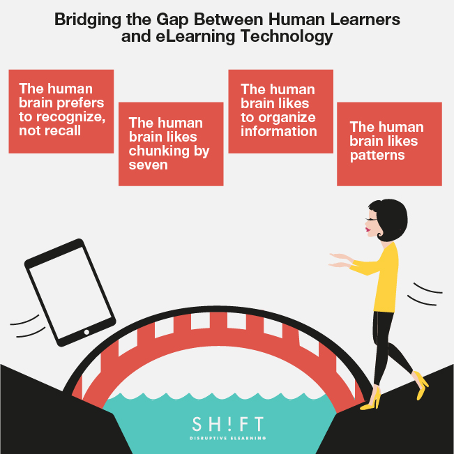
1) The human brain prefers to recognize, not recall.
Clarity, familiarity, and consistency should all be common goals as you design an eLearning course. Humans aren't good at remembering things, so courses should be designed with this in mind.
There are certain design elements on the course that should always stay the same. Learners should not have to spend more time trying to remember what an icon represents, or how to navigate from one page or section of a course to another, than they do engaging in learning the material.
Minimize the user's memory load by avoiding visual clutter, and instead, provide visual cues. Don't overload a page with text and images; white space on a web page IS acceptable and preferable! Use headings, lists, and prompts to assist the learner. Provide a menu in a prominent place for easy access, guidance, and navigation tips.
2) The human brain likes chunking by seven.
Chunking is the term and the concept to remember. A variety of research could be summarized by saying that short-term memory has a capacity of about "seven plus-or-minus two" chunks. Just as trying to carry too many things at one time can cause you to drop something, requiring learners to grasp too many concepts or attempt too many tasks at one time can cause them to "drop" that information.
The takeaway from these studies is that you should pay attention to how much information the learner is accessing at any one time. Ask yourself these questions: Is all the content relevant? Is there something you can eliminate or move to another place? Is there anything you can break down?
3) The human brain likes to organize information.
A place for everything and everything in its place; it's as true for optimal structure and organization in our homes, as it is for the learner's mind during the learning process. The learner’s eye likes to order things on the screen, such as a header with a logo at the top or the upper left, a lightbox with featured content, and instructions and navigation controls at the bottom. The proper placement of information can help learners recall knowledge when they need it.
Bullets, numbered lists, charts and tables also help break up the page and make it easy for the learner to skim the page and still gather information. These elements help the mind organize information and also guide the learner’s eye to where you as the designer want it to go.
We can use contrast to organize elements on the screen, too. You can provide plenty of contrast to pull the learners' eyes to the content and to enable learners to distinguish various types of content. Use contrasting colors for headings to set them apart from black text. Also add spaces, shapes, and images to contrast with blocks of text.
4) The human brain likes patterns.
As children, we likely played with "shape" toys with corresponding holes in a ball or on a board. As adult learners, we still like patterns, which is why it's so important to use consistent screen design with clean structure and to group objects by function or appearance. Visually appealing grouped objects affect both perception and interpretation, and enable learners to determine whether objects are connected or unrelated. Moreover, studies reveal that our brain produces dopamine (a pleasure-inducing neurochemical) when we recognize familiar patterns in a certain environment. "When we act on these patterns and are successful in whatever we are trying to do, we get an additional burst of this pleasing chemical" the study says.
Easily accessible, uncluttered presentation engages learners and reduces distractions. Learners prefer order over chaos, and a well-structured format will increase the learner's confidence and sense of control over the learning process. Make sure all relevant information is visible and easily accessible and there are no obstacles that keep your visitors from reaching their goal efficiently.
Let's summarize: Effective eLearning design should incorporate human factors, including the brain's preferences for recognition, chunking, organization, and patterns.
Consider these four major human factors as you work toward implementing the most effective eLearning design!


