As eLearning professionals, we believe in the value of learning from others. Collaborative learning is an essential learning strategy and one we can apply to our profession as well, especially in eLearning design.
Our field is relatively young compared to the rest of the online world, where designers have been making and refining websites for decades. Those web design professionals have studies, researched and honed their craft, and have developed some basic web design principles that lead to effective websites.
These web design rules can teach you everything you need to know about eLearning design and connect you with an industry that has already fine tuned this field.
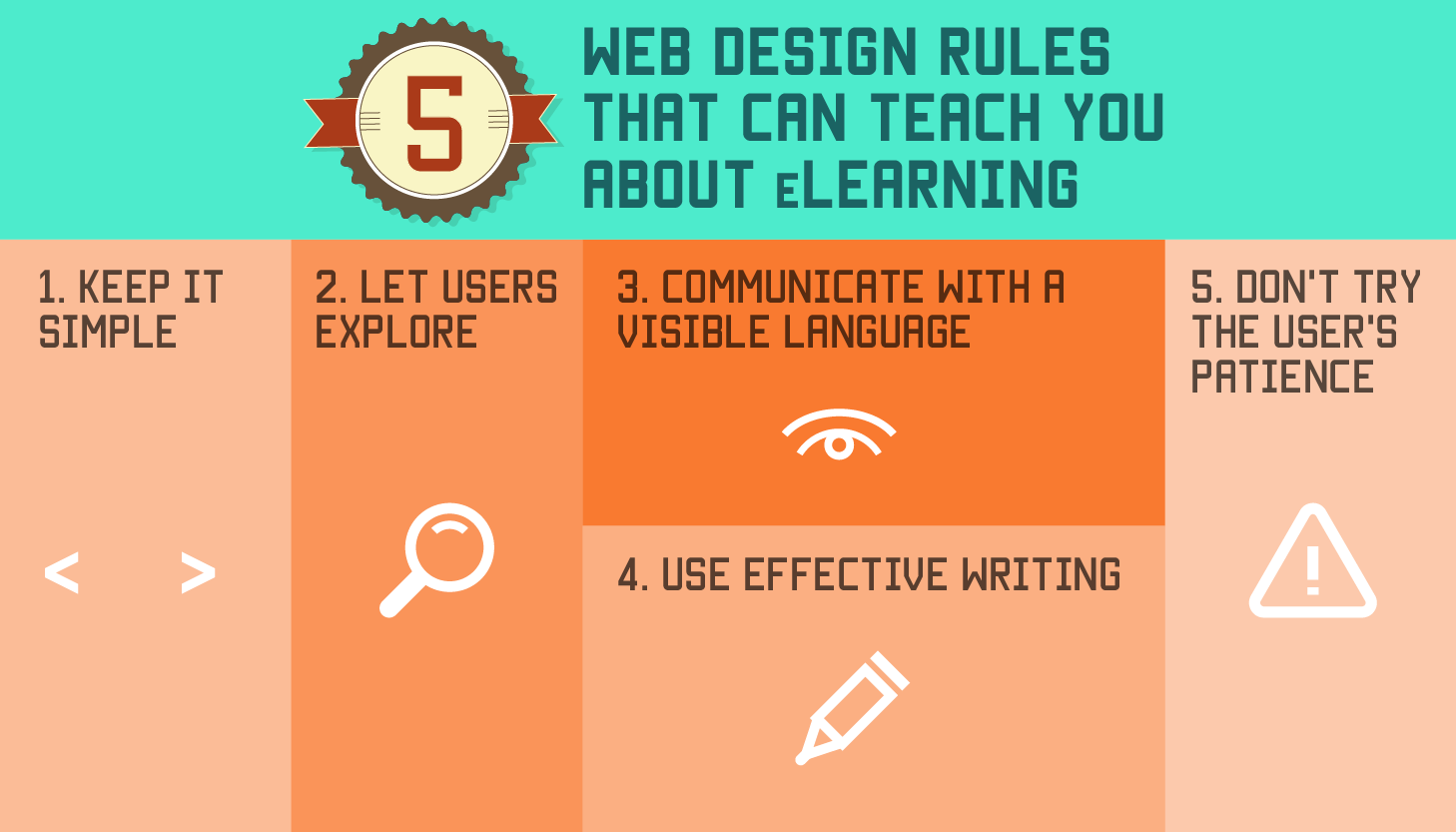
1. Keep it simple.
Simple is always better, especially in web design. Simple is beautiful, easy to understand, and generally a departure from websites that try to fit too much into every web page.
eLearning designers can learn from the simplification element of web designs. Presenting information in its simplest form is optimal for the learner whose main goal is to learn. Learners can intuitively follow a simple website more easily for several reasons. Simple websites are easier to skim and scan for information. They are easier to navigate because there are fewer navigation choices. And, they load faster.
To make your eLearning course design simpler:
- Unclutter your sidebars or navigation bars to include only the information learners need to know;
- Use several subheads to break up the text and make it easier for learners to find what they need quickly;
- And minimize images by using one or two strong images rather than four or five plus animation.
2. Let users explore.
Simple doesn't have to mean boring, though. In fact, exploration creates engaging learning experiences. Letting users to discover information instead of simply stating it as blocks of text will allow learners to to break new ground and get the most out of the 'do' aspect that is essential to effective learning.
Find ways to incorporate explorative elements as they move through the course to keep them excited and interested to see what is coming on the next page. It’s all about allowing learners to explore content on their own.
Rather than feed learners content, design courses that allow them to explore concepts and ideas, try them out in different scenarios, and engage in inquiry based learning.
Guided learning where the course uses prompts, cues and questions will yield more surprises and longer lasting learning outcomes than spoon fed content.
3. Communicate with a visible language.
Communication experts consistently reinforce the fact that our non-verbal communication speaks louder most times than our words do. In web design, the visual elements of a website or online course act as the non-verbal language. Getting this visible message right is just as important, if not more, than the instructional design and learning theory. Leaving it to chance isn’t wise.
The elements of visible language in eLearning design include:
- Layout of the eLearning course features;
- Typography, including font styles and sizes;
- The color and texture of various elements;
- Signs, icons, symbols and pictures in the course;
- Animation or video;
- And the sequencing of features that result in storytelling.
In eLearning design, keep in mind three basic principles for a visible language that helps the learner: organization, economy and communication.
In practice, this means organizing all the elements consistently and clearly to move the learner through the course. Economize on features by only using as many elements as you need and eliminate extras, which distract learners. And ensure the message is communicated clearly by making it visually readable.
4. Use effective writing.
This is one area of web design too often overlooked as designers focus on the look and feel of a site. But, text has to be written well, and written well for an online audience or no one will read it.
Truth is corporate speak writing won’t be read naturally. Long texts without images will be skipped. Writing that isn’t straight-forward, conversational and relative to the learner will be ignored.
To use writing effectively in eLearning design:
- Stick with a narrative tone of voice, one that tells a story;
- Avoid "corporate speak," a tone that will make learners skip over the text;
- Write in short text blocks as long text blocks are difficult to read online;
- And use subheads and titles regularly and often because online readers skim and scan text.
5. Don't try the user's patience.
Ever been to a bad website? Of course and you probably left it as soon as you got there. Today's online users want websites that load elements quickly and have user friendly elements. They do not want to jump through hoop after hoop to get to the content they want or need, such as filling out lengthy forms or questionnaires.
When it comes to learning, it is better achieved without distractions. If less is required from the learner to use the course, the more time they have to learn the content.
In eLearning, make sure your content is optimized for quick loading. And check all your processes. How many steps do learners need to take to access the content? Can you reduce the number of steps?
You know great web design when you see it because it employs all five of these essential rules. Apply these rules to eLearning design and watch your courses take off.