A picture is worth a thousand words. It’s trite but true. And when it comes to eLearning, picking images is a life-and-death decision. That’s because an image can single-handedly destroy your material or make it memorable.
Good images are more than just pretty visuals. They’re not mere fillers or elements chosen for the sake of filling up a space. They should, instead, satisfy both aesthetic and informative requirements—that is, make a point in a clever, clear and captivating way.
While image fundamentals such as size, composition, quality and exposure are important things to look for, they alone don’t guarantee that a particular image is best for your eLearning material.
Ask, instead, these following questions:
- Relevancy: Does the image reinforce or support your message?
- Effectiveness: Does it invoke interest or excitement?
- Uniqueness: Does it stand out and easily get noticed?
- Message: Does it transmit the right message to learners?
If you answer yes to all these questions, then the image works. Here’s a step-by-step process to choosing images for your eLearning courses:
1) Consider, first, the goal of your slide or screen.
It’s not a good idea to start a photo search looking for inspiration. Instead, it should start with clear goals. This will lead you to the right images.
Images should serve the primary purpose of a specific slide. They should get the intended message across. Otherwise, the chosen images will only confuse the audience or weaken the message.
2) Next, take time to find the right images.
You perfectly understood the goal of each screen, now it’s time to look for the right image—one that would complement the key message.
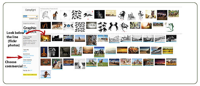
Don’t rush. Look around and check your options to get the most effective result. If you have existing screenshots or photographs to use, start with them. Then search websites like Compfight or Flickr’s creative commons search functionality. Stock images found on Sxc.hu and MorgueFile are good options as well (free). If you don't find a suitable image through free sources, there many affordable paid resources such as istockphoto and BigStockPhoto.
Remember, wheteher you choose a free (but legal) alternative or a paid resource you need to be careful and protect yourself from copyright infringement claims.
Also, don’t be lazy. Resist the temptation to use the first image that comes your way. Look for one that’s relevant, clear, compelling, who’s subject is immediately recognizable, with good proportions and vivid colors. Remember, to help evoke emotions you need to look for large and striking images.
Click on an image you like and a new tab will open on flickr. To download the image, click on the “Actions” dropdown and select “View All Sizes”. Here, choose the size you want to download.
Suggested resources:
- How to Find Flickr Photos with a Creative Commons License
- Helpful information about image copyright rules and how to license stock photos.
- Getting Great Images (and staying out of legal trouble)
3) Modify images to enhance them.
The perfect image is a rare find. Most of the time, you will have to stylize an image, crop it, or manipulate some of its elements. Instructional designers usually edit a stock image not only to fit or perfect it but also to make it more unique and own it. Here are some ideas:
Crop it. If you don’t need the whole photo, cut it down and retain the most attractive part. Cropping can help make a photo more dynamic by simply revealing more about the story you want to tell by focusing your learner’s attention on a particular detail.
Blur it. By playing around with contrast, saturation, hue and brightness you can add a unique factor to your stock images. Some images are much better-looking when you blur the background or uninteresting parts. You can, of course, crop it first then blur some parts next.
Fill the slide background with the image’s dominant color. Use a color picker tool to get the accurate color shade. This will effectively blend together the image and the slide background.
Change the shape of the photo. Follow these easy steps to turn a standard photo into an interesting and eye-catching design element for your next eLearning course.

Suggested resources:
Important Considerations:
Whichever photo editing technique you employ, be sure to check the following:
- Consistency of Style. Use images consistently all throughout the material. Focus on every individual slide, that is, the individual jigsaw piece, but don’t forget to neatly put them together. Consistency will make it easier for learners to connect the slides.
- Details. Eye-tracking studies confirmed that detailed images yield better results.
- Emotionally-charged Images. The best visual elements evoke people’s emotions. They make people laugh, talk, excited or simply get them engaged.
- Size matters. Resize your pictures before you add them into your course, to ensure that you keep your file at a manageable size. Web designers typically recommend 500 pixels in 300dpi, although 72dpi offers the best resolution.


