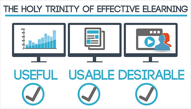
Usability, along with utility and desirability, unlocks the key to effective eLearning courses. By following these three essential principles, course developers are able to create great learning experiences for learners of all types.
Donald A. Norman, says in his book Emotional Design: Why We Love (or Hate) Everyday Things that "It is not enough that we build products that function, that are understandable and usable, we also need to build products that bring joy and excitement, pleasure and fun."
The good news is, any eLearning professional can learn how to apply usability, utility and desirability principles. Here's a list of questions to get started. Make the most out of them and help students make the most out of your course.

Useful: Is it helpful?
Before anything else, the first question you need to ask yourself is: Can learners achieve their goals? Don Norman clearly states that the degree to which users find the course or website useful is measured by their ability to achieve those goals.

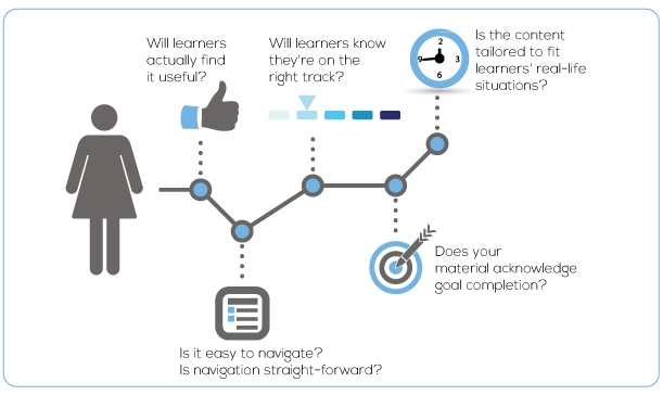
1. Will learners actually find it useful?
In the introductory slides or in the first few paragraphs, students should be able to answer for themselves the proverbial question: How will completing this course make my life easier?
Make them answer yes. Specify the why.
Why do they need to have a background on company products? Why do they need to learn how to avoid computer viruses? Why is acquiring basic HTML and CSS skills valuable?
2. Is it easy to navigate? Is navigation straight-forward?
Navigation is one of those things you must get right. Does the course that has a friendly direction?Is immediately clear to the learner what to do next? Try to keep every button simple. Use location cues so that learners can easily find their way within the course.
3. Will learners know they're on the right track? Does the course provide clear feedback in response to the learner’s actions?
Provide a clear and prompt feedback to user actions. Have they successfully answered a question? Or finished a section? Make sure your course includes appropriate feedback functionality.
4. Does your material acknowledge goal completion? Is it relevant to the learner’s needs/goals? Are you establishing the importance of this topic/knowledge to the learner?
Do your students understand their progress? Are they aware of how much they already know? Be sure they do by implementing quizzes, surveys and practical exercises. A group discussion or obligatory participation in forums can also help.
5. Is the content tailored to fit learners' real-life situations?
In other words, is your content contextualized? Is it more personalized? More situational? Or easily transferable to real-life scenarios? Are you using examples to clarify concepts or theories, and those examples are relatable?
Use success stories and commentaries from people in the field. Let learners experience an authentic setting with the use of realistic dialogue and fictitious yet believable characters. Such characters should share the challenges and priorities of learners themselves.
Usable: Is it easy to use?

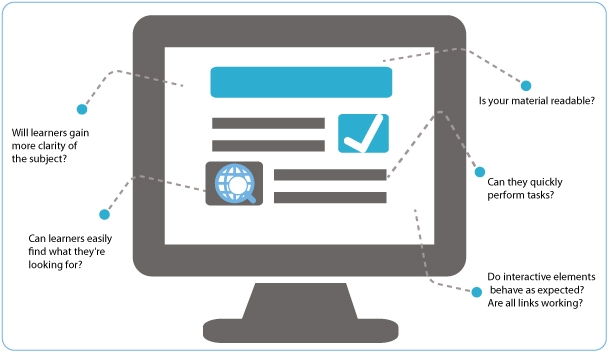
6. Will learners gain more clarity of the subject?
Is content understandable? Can users perceive what is meant and grasp the information conveyed?
Better usability leads to improved understanding or depth of knowledge. Include updated and relevant content. For better results, structure them in highly usable and digestible formats such as case studies and scenarios.
7. Can learners easily find what they're looking for?
A truly usable material requires the least effort on the part of learners. It demands no unnecessary thinking, clicking and searching. Users should be able to access the information they need in just a few clicks.
Users should be able to get from one task to another will relative ease, without having to think about what they are doing.
You can, for instance, add a search functionality that enables users to find content by author, tags, category or date. An appropriate navigation system can improve overall accessibility as well.
8. Is your material readable? Is text legible, and does text formatting and layouts support easy scanning?
Reading on screen is different from reading in print. Pay attention to how you format the screen and arrange all the elements in it.
Make it easy for users to scan your content by using bullets, lists, headings and sub-headings.
Be consistent in your use of type fonts and sizes throughout the course.
9. Can they quickly perform tasks?
Can learners use your material without difficulty? A usable material respects the user’s intention. It encourages user to engage, discover, find, read or do whatever relevant action is necessary to accomplish learning goals.
Offer a user-friendly interface so that users, especially beginners, can get basic tasks done quickly.
10. Do interactive elements behave as expected? Are all links working?
Make sure videos and media are all working properly by reviewing your course just before launching it for students.
Desirable: Is the experience engaging?
Does the course appeal to the learner’s emotions? Desirability is how we can drive learners to take action though design.

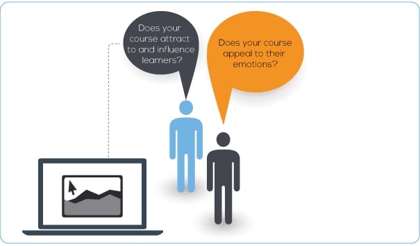
11. Does your course attract to and influence learners?
Are learners attracted to it in the first place? Are they willing to spend some precious minutes consuming your material? Desire is a powerful tool. Use it to influence users and drive them into taking action.
Take a look at the design of your course. Make it more desirable by paying attention to detail—from the language used to the effects produced by visual elements.
12. Does your course appeal to their emotions?
Does it evoke positive emotions like fun, joy, pleasure and excitement? Or does it make learners feel angry, anxious and helpless? Never underestimate the emotions evoked by your material. Remember, an effective eLearning course not only focuses on what people do and know—but also on what learners feel.
When learners feel excited, curious or appropriately challenged, they’re most likely to engage more, understand the material better and come back to finish the course.


