 You’re neither an instructional designer nor a graphic designer. In fact, you don’t have any formal background in designing educational materials and interfaces. But you are willing to create an eLearning course on your own. Making something useful and effective can be a little bit daunting especially for first-timers. Don’t worry. Here’s an indispensable guide to the basics of creating DIY topnotch courses:
1. Learners Come First
Before you start, be sure to get a clear idea of who your learner is. What are their learning goals? How will you design your module to help them attain their needs? Always consider your learner in every step of the process.
2. Outline the Structure
What makes a material effective is the way in which it is structures—how its parts are organized. There should be an introduction where students can learn what the course is all about and what is expected of them. Then aim for four to five sections per module, each with a summary section. Be sure to limit your modules to maximum 10 screens so that learners feel a sense of progress or accomplishment.
Storyboarding is a great way to outline your course structure. Using simple boxes and arrows, determine the flow of your information as if you are telling a story or devising a plot. Decide on the type and amount of interactions, videos, images, assessments, etc. that you will need to make the content understandable and engaging.
3. Design for User Experience
So how will your course look like? Designers who work on print and web all agree that designing is really about users—how they interact with interfaces and achieve their goals in the process.
Start by figuring out which fonts and color scheme to use. The design elements should make your course look pretty and functional. You have to blend both style and strategy by making sure that some colors stand out from the rest. More importantly, keep the design simple and professional.
What are the best colors for your course? It all depends on who your audience is and what you what them to feel. Use this guide to understand which colors will work best for you.
4. Make Each Section Complete and Compelling On Its Own
Weave the parts of your material into a cohesive whole. Work on each section—including its own instructions, core content, evaluation and summary—and make sure it moves your audience closer to their learning goals. Learners should be able to feel confident before they can move on to the next section.
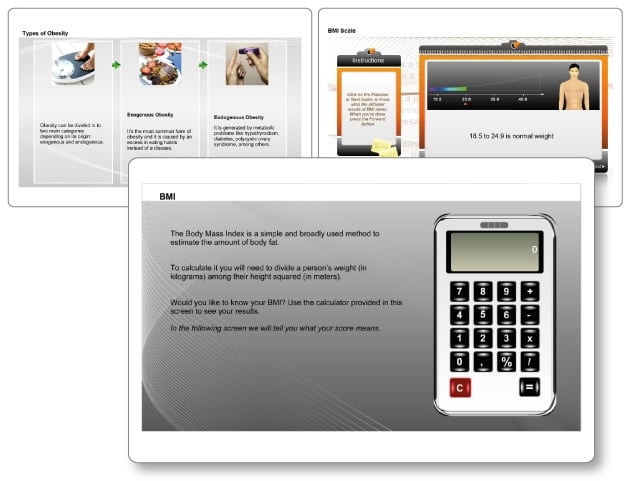
Start by making each section alive using appropriate strategies (games, simulations, scenarios, exercises etc.) so that learners stay actively engaged during the course. The main thing to remember when creating each section is to keep varying your format from one screen to another. Try doing a procedure slide followed by, say, a visually oriented information slide:

5. Create a Compelling Start
After you've created the majority of your course, head back to the start. It'll be much easier to introduce your course content if you already know what that content is.
Effective eLearning materials always start with a bang. The title screen, for instance, lures learners into the course. Make your own title screen attractive and compelling by creating an informative yet catchy title and using the right images. Relevant and eye-catching graphics helps arouse curiosity and reflects the essence of the course.
Most importantly, make your introduction clear and informative by:
-
Explaining the course objectives clearly
-
Establish relevance by setting significant goals
-
Explaining how the material is appropriate to the learner’s learning situation or context
-
Showing the learner how your material can help them
6. Create a Motivating Self-Directed Learning Environment
If there’s one thing you should get right when designing an eLearning material, it’s this: Giving appropriate incentives and opportunities for self-responses. Rewarding students when they do well increases their motivate to learn. Allowing students to assess their own learning boosts their learning independence and satisfaction.
Are students actually able to apply what they have learned? How’s their progress? Let them know for themselves by creating interactive activities and multiple-choice and formative tests after the end of each section. Make sure your activities and tests directly relate to the section content.

7. End With a Neat and Nice Summary
Section summaries are a great tool for helping students recall the main points you covered. Remind them about the objectives mentioned in the introduction and tell them how close they are to their goals by completing each section. Students will usually feel a sense of accomplishment as they finish each unit.
You may also include a link to a survey or invite students for feedback after every section. Doing so will show learners that you are ready to give them a hand anytime.
As you can see, you don’t have to be an experienced professional instructor to create an effective and memorable eLearning course. You only have to learn the fundamentals of learning, apply it in practice, and be brilliant at the basics.
Ready to create your own course?


