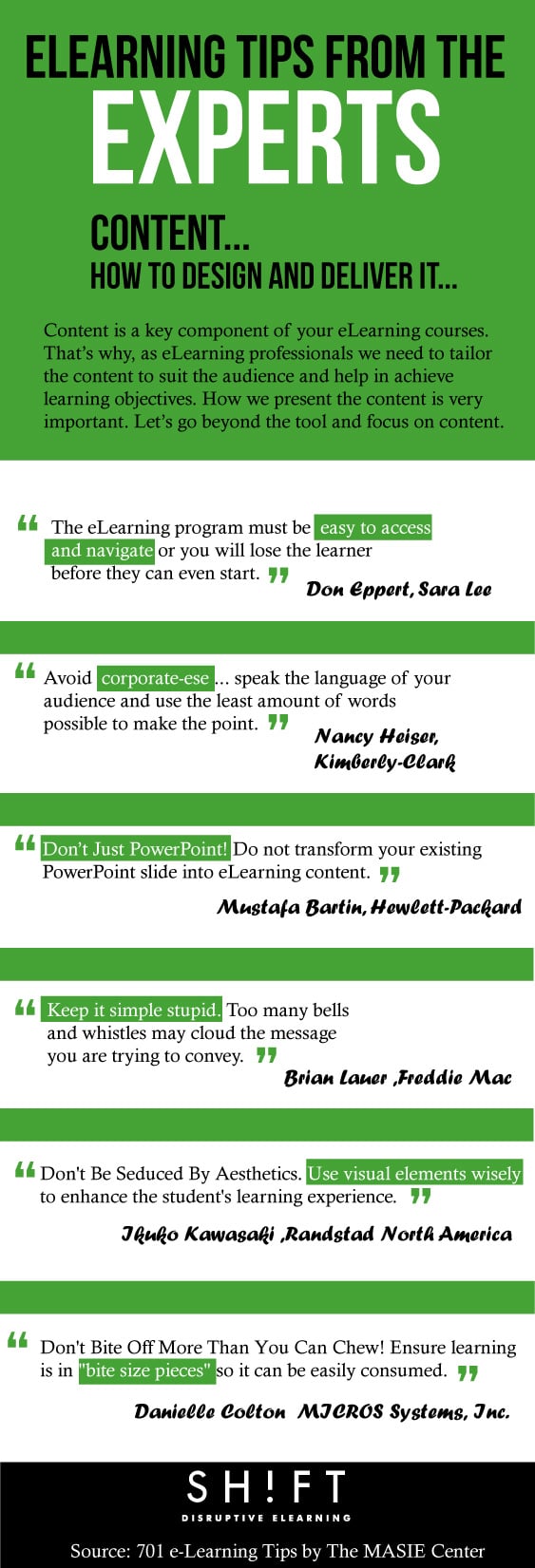
To help you master eLearning course development, we gathered some of the top quotes by different experts in the industry. These experts come from various companies, and all have expertise in the art of creating engaging eLearning experiences. Check out their expert tips in this infographic, and then read below for a quick explanation of what these tips mean for your eLearning strategy.

eLearning Tips From the Experts
“The e-Learning program must be easy to access and navigate or you will lose the learner before they can even start”. Don Eppert, Sara Lee. (Tweet This Quote!)
What This Means for eLearning professionals: Try not confusing the learner. Think about what your target audience is searching for when entering your eLearning course. This means you should ensure the course can be navigated and accessed easily because no matter how engaging the content, if the course navigation is confusing, you will lose learning begore they can even start.
“Avoid corporate-ese…speak the language of your audience and use the least amount of words possible to make the point”. Nancy Heiser, Kimberly-Clark (Tweet This Quote!)
What This Means for eLearning professionals: That means eLearning professionals need to be creating compelling content that speaks directly to their target audience. Too much formality can bore learners fast. Instead, choose a friendly and informal tone, but always transmmit content in a professional way.
“Don’t Just PowerPoint! Do not transform your existing PowerPoint slide into e-Learning content”. Mustafa Bartin, Hewlett-Packard (Tweet This Quote!)
What This Means for eLearning professionals: The first and most important of the key success factors for eLearning is to move away from the practice of taking traditional curriculum and moving it online. What works well in the classroom does not means it will in the eLearning environment. If you want to convert traditional training sessions into eLearning courses you must transform and adapt the content, not just change its format.
"Keep it simple stupid. Too many bells and whistles may cloud the message you are trying to convey, not to mention lengthen the development and testing timeline”. Brian Lauer, Freddie Mac (Tweet This Quote!)
What This Means for eLearning professionals: The secret is to KISS eLearning content, or in other words keep it simple and stupid. eLearning content needs to be simplified, either broken down in simple steps and modules or removing as much fluff and filler you find. More interactivity and visual content doesn't mean learners will learn more, so don't go overboard with these.
“Don't Be Seduced By Aesthetic. Use visual elements wisely to enhance the student's learning experience”. Ikuko Kawasaki, Randstad North America (Tweet This Quote!)
What This Means for eLearning professionals: We’ve all heard the phrase, a picture is worth a thousand words. But, if graphics are distracting rather than illustrative and colors are jarring rather than neutral, images are worth nothing. That’s why any visual element in a course should be informative, other than decorative. If you are not able to explain why the graphic/photo is used, don't use it.
“Don't Bite Off More Than You Can Chew. Ensure learning is in "bite size pieces" so it can be easily consumed when needed”. Danielle Colton, MICROS Systems, Inc. (Tweet This Quote!)
What This Means for eLearning professionals: Every eLearning professionals should understand how your student’s brain digests the eLearning content. Chunking or breaking-up content is specifically useful for our brains. The key is to feed the learners a little bit at a time, using bullet points or breaking information into steps. The method of trying to cram as much information as possible almost never works!


