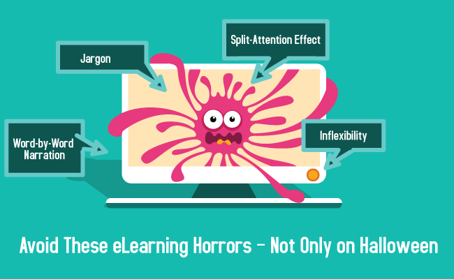
No matter how good you content is, there are a few factors that can totally kill your eLearning courses. If you are looking to create an effective eLearning design, it is essential to eliminate the following four issues.

1. Jargon-monoxide
 Jargon is more than just a disincentive for learners looking for clarity in courses, it also hurts your credibility as a whole. You may think professional vocabulary adds a sense of sophistication to your eLearning design; in fact, it alienates learners who are seeking easy to understand information that will help them learn about a subject.
Truth is people respond best to learning when the content is approachable and uses words that learners are likely to use in everyday life. To ensure you are doing this, write content that you would like to read. By using first or second person and a conversational tone, users can better relate to the content. Use plain English, clear-cut wording and terminology to translate jargon into a language every learner can understand.
It is particularly important to avoid jargon in technical subjects such as for the insurance, healthcare, web development, software, and analytics industries. People will learn technical concepts much faster if the information is presented through common vocabulary rather than industry-specific language. Although it may be helpful to use the occasional complex terminology, you should always follow such terms with a definition and avoid overuse that could create confusion in your learners.
Jargon can also end up contributing to fluff, especially if you use clichéd phrases, and fluff gives the impression that your ideas are not strong enough to stand alone. Keeping your material short and to the point will make the biggest impact and contribute to an effective eLearning design.
One exception to the above is relevant anecdotes. Although anecdotes will make your content longer, it will also make it more interesting. There is a far greater chance that your learners will connect to stories than to buzzwords, acronyms, and internal lingo.
2. Inflexibility
Research has found that when learners have control over their learning environment, they achieve positive outcomes, show a greater interest in the course, trust the institution, improve their self-esteem, and are more persistent in learning the material. With an effective eLearning design, you can ensure your courses promote autonomous learning.

Julie Dirksen, author of Design for How People Learn, suggests eLearning professionals to respect adult learners by giving them “control over their learning environment.” Adults, you see, don’t like learning when they feel information, ideas or actions are imposed on them from the outside.
The easiest way to give learners control is through navigation. It is important to recognize that everyone learns at a different pace and uses a different style. Limited navigation, where learners must click through each screen before reaching desired content, can lead to frustration and cause students to shut down mentally. Your course navigation should allow learners to take their own path through your content and even return to previous sections of the course if they wish. Having this amount of control will help building intrinsic motivation. It is also more efficient, since the learner can skip the content they already know.
When possible, avoid locking navigation— where screens only open when learners complete the previous material. This common attempt to help learners get the most out of the course forces students to learn in the way that the developer believes to be best. However, this method may not be appropriate for your learners, particularly if some aspects of the course are irrelevant or uninteresting to some of them.
Similarly, you should never force learners to move too fast through material. Those who are new to the subject may require more time to assimilate content and may wish to repeat sections. Make flexibility a built-in feature in your courses. You can, for instance, offer your content in several portable formats so that adult learners can access them across several devices..
3. The Split-Attention Effect
 An effective eLearning design will never include formats that require learners to split their attention over multiple sources of information at the same time. The working memory has a limited capacity and duration, meaning that trying to focus on too many things can lead to cognitive overload.The result is that learning is reduced.
You cannot separate text from graphics. Though these are different devices, both have a common purpose of clearly and effectively presenting information. Only by bringing them together, they enable you, the designer, to tell a good story.
In order to do this, you have to consider which images or visual elements would help readers understand your written content best. When integrating both explanatory text and related visuals, make sure they are located close to one another and on the same screen. Requiring learners to access related content on two different screens can present information overload. This can cause confusion, thereby increasing the cognitive demand of the task.
Furthermore, every illustration or diagram should be understandable without explanation; the accompanying video, text, or audio should simply enhance understanding, and the link between the two must be obvious.
Also don't forget to identify the most important content and cut the nonessential parts; cut out unnecessary graphics, animations, visualizations, and multimedia that draw attention away from the main source of information.
Must-read:
- How to Avoid Designs that Split Attention
- Slideshare: The Split Attention Principle in Multimedia Learning
4. Word-by-Word Narration
Communication is actually inhibited when the same words are spoken and displayed on the screen because people cannot listen and read at the same time. (Paivio, 2007)
 Research has found that learning becomes inhibited when audio matches text word for word. This is because such practice impedes the audio loop in the working memory and increases cognitive load in the visual sketchpad. This is not to mention that word-by-word narration makes a course monotonous and confusing and limits a learner’s capability to explore onscreen content. Instead of reinforcing the information, this creates redundancy and will confuse the learner. If your audio reads the exact words on screen, then your audio may slow down your learners pace.
To contrast, in effective eLearning design audio will summarize onscreen content, it complements and augments the images, or list the most important aspects of a slide. Therefore, you should limit audio narration to the following situations:
- When describing a procedure or complex concept that you want learners to follow without needing to read text.
- When you want to emphasize the emotion in your content.
- When you want to have characters speaking as part of a scenario.
- When audio will otherwise improve the learnability of your course.
Here are our 4 major eLearning horrors – avoid them at all costs if you don’t want your courses to be a turn off for your learners!


