Here’s a news flash: If you want to be really great at eLearning design, you need to know more than how to come up with an attractive look and content that gets attention. What’s the secret? Becoming savvy about psychology and behavior.
Why? Psychology plays an important role in creating content because it’s all about your learner’s emotions and perception. Simply put, as designers, we have to build effective eLearning courses based on needs and emotions to instill feelings in eLearners. Knowing a bit about social patterns doesn’t hurt either.
Design Based on Psychology
The whole point of taking psychology into consideration is the end product: individuals who are happier and who will probably experience effective eLearning. Take a peek at some thoughts on the psychology of design:
- “Psychology is the science of behaviour and the mind. When design and behaviour match, the design will be superior.” Simon Norris, NOMENSA.
- “A great-looking design isn’t always a great working design and often design without psychology is a source of dangerously misapplied effort.” Paul Davies
- “Designers are actually psychologists who can draw.” Paul Davies
Here are the most important design elements to build effective eLearning courses:

1. Color Psychology
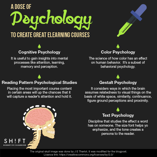
It acknowledges that colors have important roles in effective eLearning design because each one affects the mind. Experts define color psychology as the science of how color has an effect on human behavior. It’s a subset of behavioral psychology.
What do we need to know about color? Start with how color affects emotions. It’s true that an eLearner’s preferences for colors are subjective in part. However, it’s also universally true that reds (red, yellow and orange) are warm hues that trigger emotions ranging from comfort and warmth all the way to anger and hostility. Blue tones (blue, green and purple) are linked to calm feelings, but they can also bring forth sadness or indifference.
Here are three helpful resources:
- A guide to psychological associations colors generate
- Seven color tutorials for those who do Web design
- 6 Ways Color Psychology Can Be Used to Design Effective eLearning
2. Gestalt Psychology
It’s a doctrine that evaluates the human mind and behavior as a whole. It considers ways in which the brain assumes relatedness to visual things on the basis of white space, similarity, continuance, figure ground perceptions and proximity. For example, if you see a group of three rectangles, one triangle, an oval and a circle, your brain will assume the rectangles are related.
There are five reasons why you should pay attention to Gestalt psychology:
- It will help you organize content effectively on screen.
- Knowing how eLearners perceive visual things helps you design accordingly.
- Its concepts help you control unity and variety.
- Understanding these principles results in more harmonious designs and boosts the probability that you’ll communicate effectively.
Here are some helpful resources:
- Online Course: The Ultimate Guide to Gestalt Psychology and Web Design
- Gestalt Principles: How Are Your Designs Perceived?
- Understanding and Using the Laws of Perception in eLearning Design
3. Text Psychology
This discipline studies the effect a word has on someone. As a matter of fact, some words are able to generate both emotional and physiological reactions. Why is this important? Choose the right word, and you can both grab an eLearner’s attention and nudge him or her into action. To be successful with text, you need to overcome the absence of images or video. Try concentrating on these attributes:
- Emphasis includes font size. Differentiate to call attention to certain text.
- Tone creates a persona to the reader. Using second person (“you”) focuses attention on your reader.
- Typeface selection can affect not only emotional state of the learners but also their cognitive state. (Read more on Font Pyschology)
- Use the right words. Here are 6 Compelling Words and Phrases to Use.
Must Read: The Psychology of Writing Online: Which Words Matter the Most
4. Cognitive Psychology
It will help you as a designer to gain insights into mental processes like attention, learning, memory and perception. To create effective eLearning content, it’s essential to understand how people learn and how the brain works.
One popular theory rests on the idea that you should build courses taking into consideration exactly how the mind learns and research regarding eLearning features that encourage the best learning.
Here’s a good place to find more about the many aspects of cognitive psychology: 10 Ways to Learn Cognitive Psychology
5. Reading Pattern Psychological Studies
Did you know that researchers can figure out what a person has selected to process from an image by measuring where the eyes point?
This means that as a designer, you can figure out what draws a person to the right or left and what will make an eLearner’s eyes stop. Placing the most important course content in certain areas will up the chances that it will capture a reader’s attention and hold it.
What’s the right way? People most often read in a F pattern, starting at the top/left and ending in the bottom right. This is one reason why so many logos appear in the upper left portion of a screen. Each screen of your course should have a definite focal point so that your eLearner knows exactly why he or she is there.
Need more information? Try checking out these resources:


