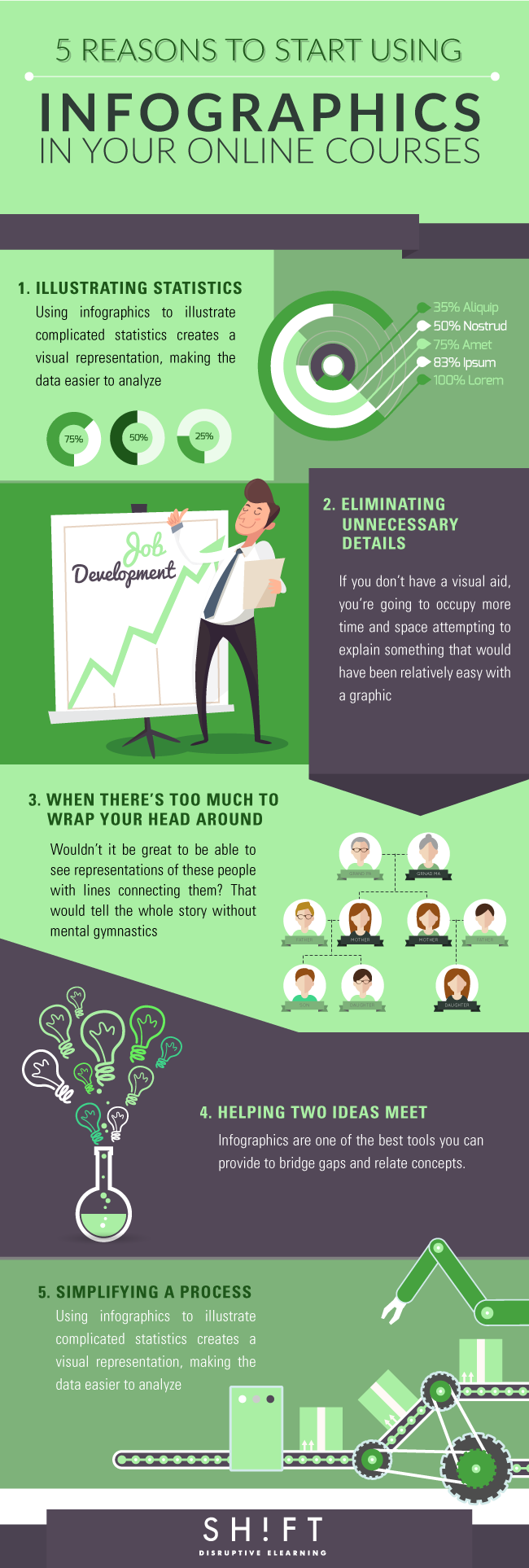
There’s a reason everyone is using infographics. A casual stroll through the social media playground will show you that many people are using infographics for mundane things, such as entertainment facts. This content is shared so often because it’s interesting, and the format makes it easy to digest. When given the opportunity, people would much rather look at an image or watch a video than read, and taking advantage of that for your online course design can help improve learner engagement by appealing to the common preference of visual learning.
The “why” is simple – understanding the “how” and “when” is what will allow you to use them effectively in your online courses.

1) Illustrating statistics
Data is crucial for understanding many concepts, but it’s also notoriously difficult to visualize. Reading a long block of numbers and trying to determine how they correlate is difficult for even the savviest reader. Using infographics to illustrate complicated statistics creates a visual representation, making the data easier to analyze. If learners know what they’re reading, they’ll be more inclined to retain the key points of your statistics.
Read: A 5-Step Guide To Creating Compelling Infographics of Your Own
2) Eliminating unnecessary details
A picture is worth a thousand words, and that will always be the truth. If you don’t have a visual aid, you’re going to occupy more time and space attempting to explain something that would have been relatively easy with a graphic. An infographic will allow you to present direct comparisons and representations of the concepts you’re attempting to convey without convoluting your information. You won’t run the risk of learners becoming confused or bored.
3) When there's too much to wrap your head around
Susie is Bobby’s cousin, and Bobby married Linda, who isn’t Barbara’s daughter, but Catherine’s daughter. Not Bobby’s neighbor Catherine, Catherine who owns the bakery with Susie. If you have no idea what you just read, that’s because it’s very difficult to connect. Wouldn’t it be great to be able to see representations of these people with lines connecting them? That would tell the whole story without mental gymnastics.
Read: When to Use and When Not to Use Infographics in eLearning
4) Helping two ideas meet
If you’ve taught two separate concepts that are intended to come together at some point, it won’t always be apparent how they work synergistically. Displaying them beside each other and showing the points where they cross over is the simplest way to help your learners make the associations you need them to. Infographics are one of the best tools you can provide to bridge gaps and relate concepts in your eLearning courses.
5) Simplifying a process
If you teach a science of some sort, a lot of your course materials will relate to processes. Evolution, reproduction, and even plant growth are all complicated processes that occur in stages. An infographic can help relate the information to a visual of what occurs at a specific point during that process. Following the infographic to the end, your learners will understand the concept from start to completion while being able to see with their own eyes how a transformation is transpiring.
Though infographics are excellent tools, they won’t be as effective if they aren’t designed correctly. Stick with appealing color schemes, simple graphics, and valuable information. Never use an infographic just for the sake of having one, and don’t create a graphic that’s too complicated to serve its need. The purpose is to simplify, not to decorate.
About the author:
Kelly Smith works at CourseFinder. She’s interested in new eLearning trends and tools. She’s keen on work-life balance and healthy work environments.


